Typography
The typeface used throughout the webapp (the rest of TheAppBuilder platform) is Lato. Various font weights, styles and sizes are used to establish a sense of hierarchy for the content, and the differentiate elements such as quotes from people.
The styles below illustrate the styling that the webapp text should follow. The font-size of the text, line-height and words per line should be taken into consideration as the webapp should provide a comfortable reading experience for its users.
Altering the default text styles using the wysiwyg editor
App Editors have control over styling a modular page by choosing how to present styles using the wysiwyg editor. They can specify if a piece of text is a paragraph, or a heading one, or a blockquote, for example. The styling below should be applied to this text when it is shown in the webapp - these are the default styles for each type.
However, users can override the default styling. They can make any heading or paragraph bold, they can alter the text-alignment and they can change the colour of the text, simply by selecting those options using the wysiwyg.
Since many of our users will not specifically make changes to the standard heading and paragraph styles, it is important that the default options look great and provide a good reading experience for the end users.
-
The quick brown fox jumps over the lazy dog
-
The quick brown fox jumps over the lazy dog
-
The quick brown fox jumps over the lazy dog
-
The quick brown fox jumps over the lazy dog
-
The quick brown fox jumps over the lazy dog
-
The quick brown fox jumps over the lazy dog
-
“The quick brown fox jumps over the lazy dog”
-
Share this post
-
The quick brown fox jumps over the lazy dog
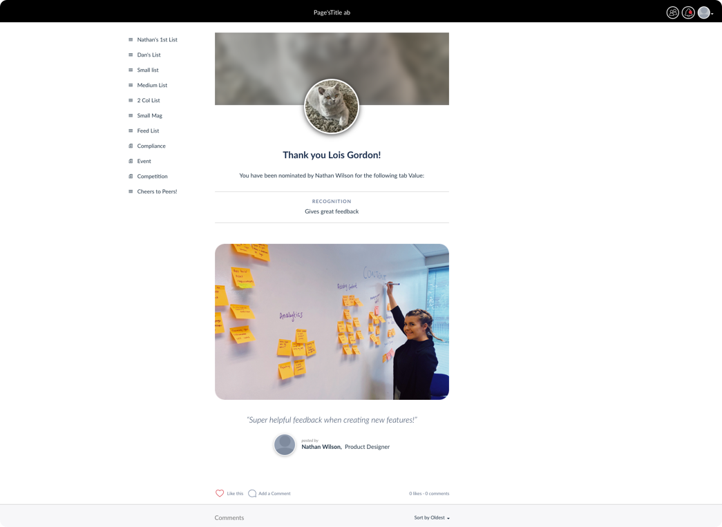
A good example of a page template that contains many different text elements is the recognition page. When a user is thanked the details are presented on a specific template that contains several elements including a comment from the user and a block that shows the value the staff member lived by.

Various text styles are shown in the recognition page layout
Social text styles
The examples below show the styles that should be applied to the different social elements found in the web app including comments and the social action bar.