Error Handling
Error alerts are used to show users errors they have made when filling out forms in the app.
Error Alert Placement & Design
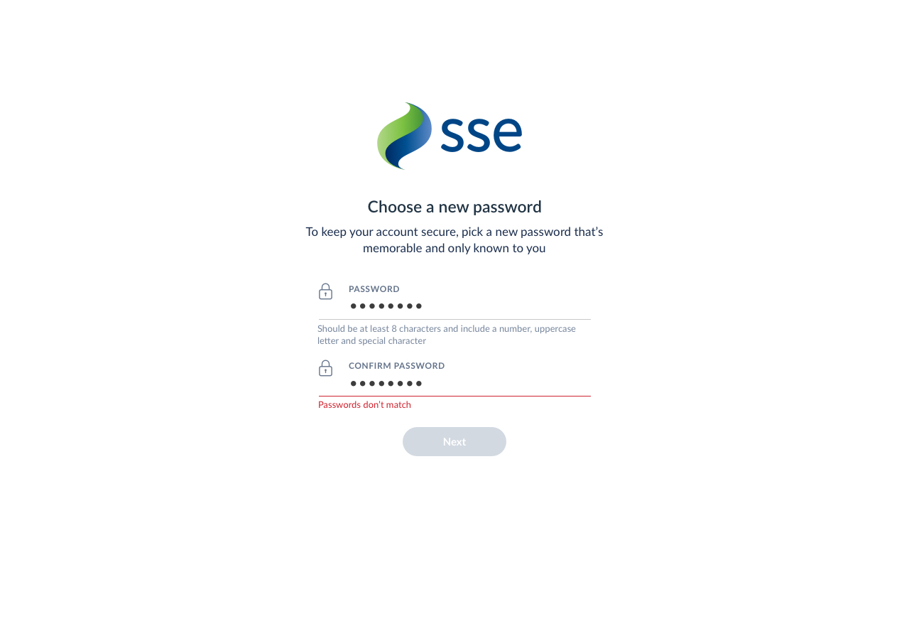
If the user makes an error when completing a form or their submission is not accepted, the fields containing the errors are highlighted. The border at the bottom of the field should be red and the error message should be presented underneath the field.

The relevant fields that caused the error are highlighted
Error messages should be succinct and helpful to the end user, as they should quickly describe the issue so the user knows how to eradicate it. For example, if the user chooses a new password that does not comply with the password rules, instead of seeing the error message “This password is incorrect” they should be told what they need to include, e.g. “Password should contain an uppercase letter.”
Password is incorrect
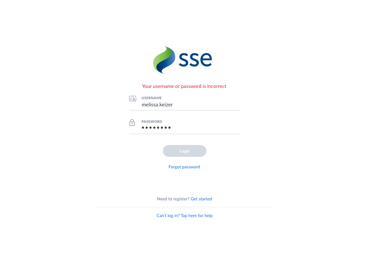
There are some cases in which the error message will be shown above the form group and will not highlight the particular inputs that have caused the issue. For example, we show the error message "Your username or password is incorrect" in this style as it is against our security protocol to indicate which of these fields is incorrect.

Error message shown above form group in some cases
Error Behaviour
The following steps out the behaviour of the error alert and button states as the user interacts with forms in the webapp.
Error messages will persist
This is so users can refer to the error at anytime. For example, if a user chooses a new password that does not fit the requirements, they will see an error upon submitting the form. This error will stay on the screen as they fill out the form again, so that they can refer to the guidance the error provides.
Buttons will always be active
Unlike the mobile client, the webapp has more screen space to highlight specific form fulfilment requirements so onscreen prompts are easier to manage within the display to the user.
The button should remain active after form submission
Similarly to the mobile behaviour, if the error is a problem with the server for example and the user has entered 'correct data', the user doesn't/shouldn't have to take corrective action within the fields if the issue is not with their data