List Layouts
List layouts are used throughout the native app as a way to display list items. They give content structure and visually organise it.
List items include:
- Pages
- Lists (within lists)
- Images
- Videos
- Web page links
- Contacts
- RSS
Chosen list layouts are determined by the app editors on the CMS. The ‘Layout’ tab shown when editing a list, is where app editors can choose their preferred layout for that list.
List Items
List items are the blocks which contain content within a list. The elements that make up a list item are:
- Title
- Icon (if enabled)
- Time Stamp (if enabled)
- Featured Image
- Gradient (if enabled)
Displaying Icons
Icons are displayed underneath the list item title or positioned on the featured image. Icons are displayed with a line of text depending on the list item type. For example, a page list item is displayed with a page icon and ‘read post’ written next to it. Here are the typography styles for the icon text:
- Lato, Regular
- 26pt
- #FFFFFF
- Left aligned
Displaying Time Stamps
The time/date preference that is displayed is determined by the app editor in the CMS. They can choose to display time updated or time posted.
- Display minutes up to 59 mins then switch to hours
- Display hours up to 23 hours then switch to days
- Display days up to 7 days then display date
Typography
Titles, time stamps & icon text
The same typography styles are used throughout on each list layout. Titles and time stamps are mostly the same on each list layout, apart from a select few.
Time stamps follow the same style throughout the list layouts, apart from in some they change from white to dark blue.
Below are the typography style used with:
Large Mag list and Heros
-
This the title of a list item
-
1 week ago
-
Read Post
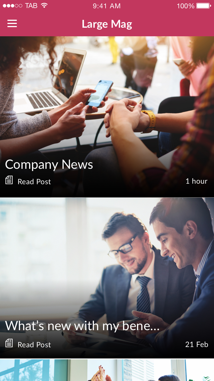
Large mag typography.
Small List, Medium List, Feed List & 2 Column
-
This the title of a list item
-
1 week ago


Small List (left) and Medium List (right) containing all the elements that make up a list item.
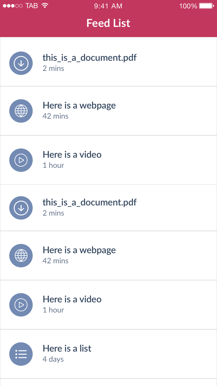

Feed List (left) and 2 Column List (right) containing all the elements that make up a list item.
Small Mag & Letterbox
-
This the title of a list item
-
1 week ago
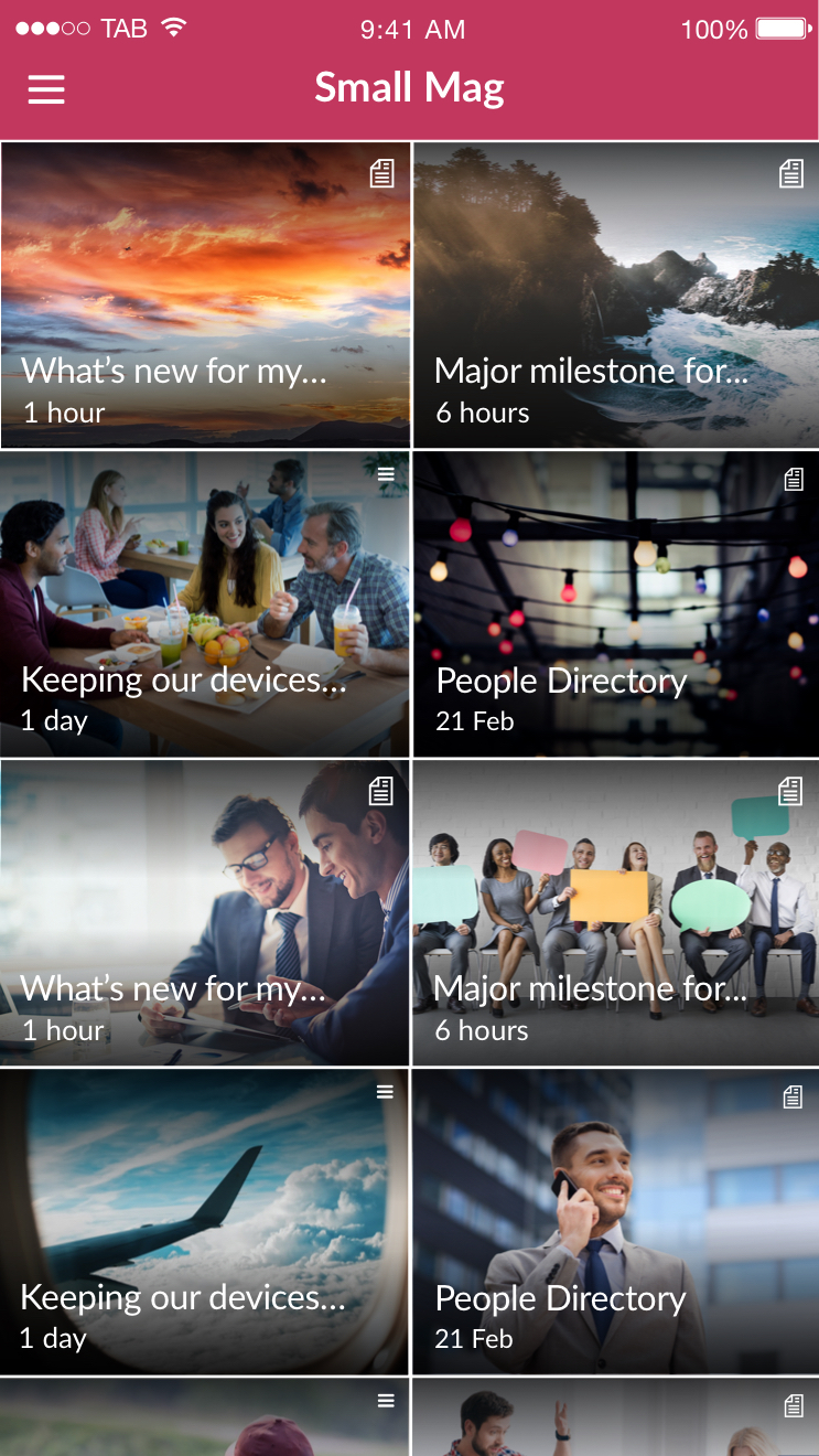

Small Mag (left) and Letterbox (right) containing all the elements that make up a list item.
List Layouts Specifics
Large Mag
Large Mag presents list items one per row and is best suited to lists that have good quality imagery as this list is very visual.
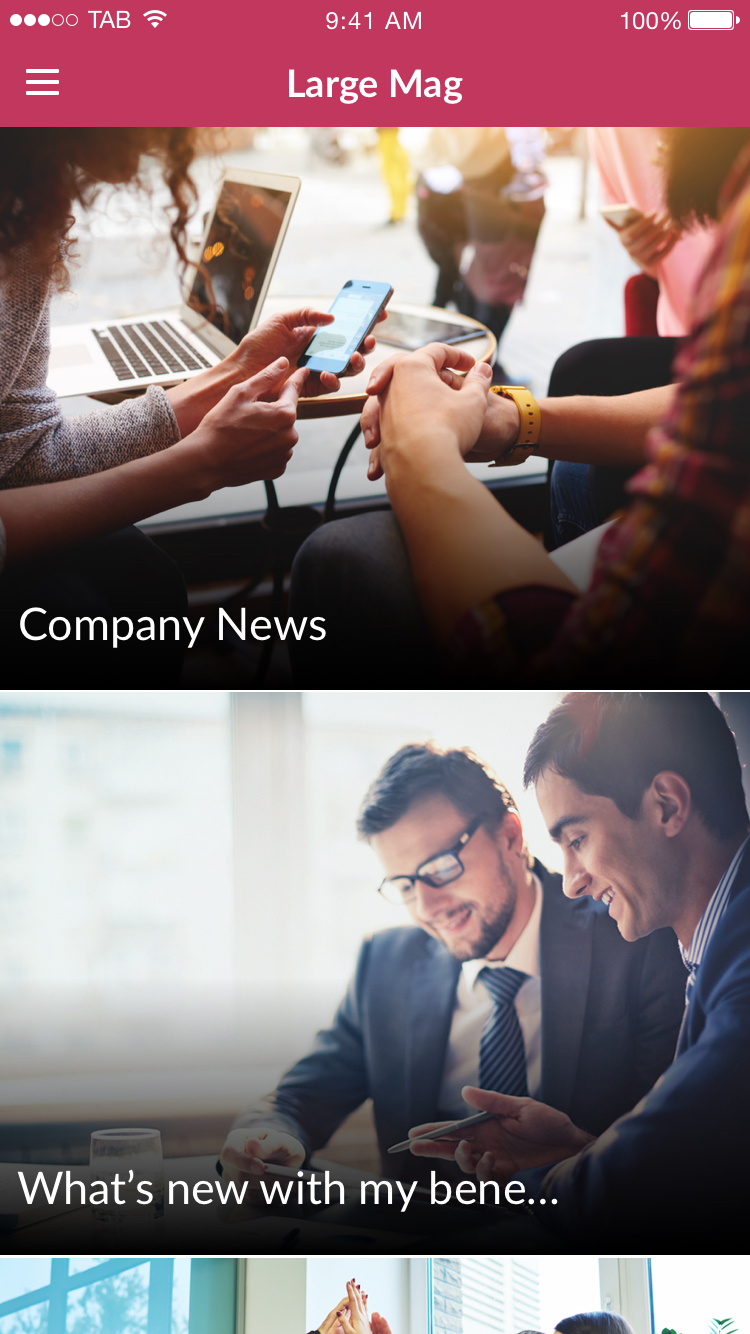
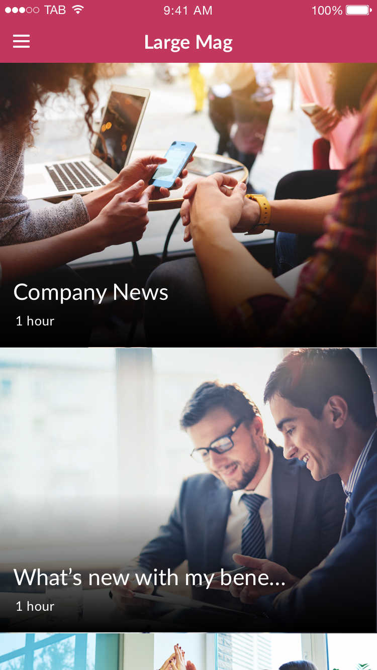
Just titles (left) Titles & time stamps (right)

Titles & Icons (left) Titles, icons and time stamps (right)
Displaying icons
Icons are displayed underneath the list item title. Icons are displayed with a line of text depending on the list item type. For example, a page list item is displayed with a page icon and ‘read post’
Small Mag
Small Mag presents list items 2 per row and is best suited to lists that have good quality imagery. Similar to Large Mag it is very visual and focussed on the featured image.
Use of gradients with icons
When icons are enabled with this list layout, gradients are automatically enabled to the top and bottom of the featured image. This is so the icon can be clearly seen against the featured image.
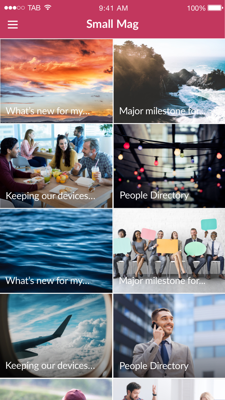
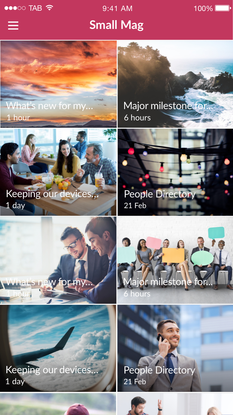
Just titles (left) Titles & time stamps (right)

Titles & Icons (left) Titles, icons and time stamps (right)
Small List
Small List presents list items 1 per row and presents the list item title clearly beside it in a dark blue colour.
Use of gradients with icons
When icons are enabled with this list layout, gradients are automatically enabled to the bottom of the featured image. Although gradients can be still turned off even if icons are enabled.


Just titles (left) Titles & time stamps (right)

Titles & Icons (left) Titles, icons and time stamps (right)
Medium List
Medium List presents list items 1 per row and presents the list item title clearly beside it in a dark blue colour.
Use of gradients with icons
When icons are enabled with this list layout, gradients are automatically enabled to the bottom of the featured image. Although gradients can be still turned off even if icons are enabled.
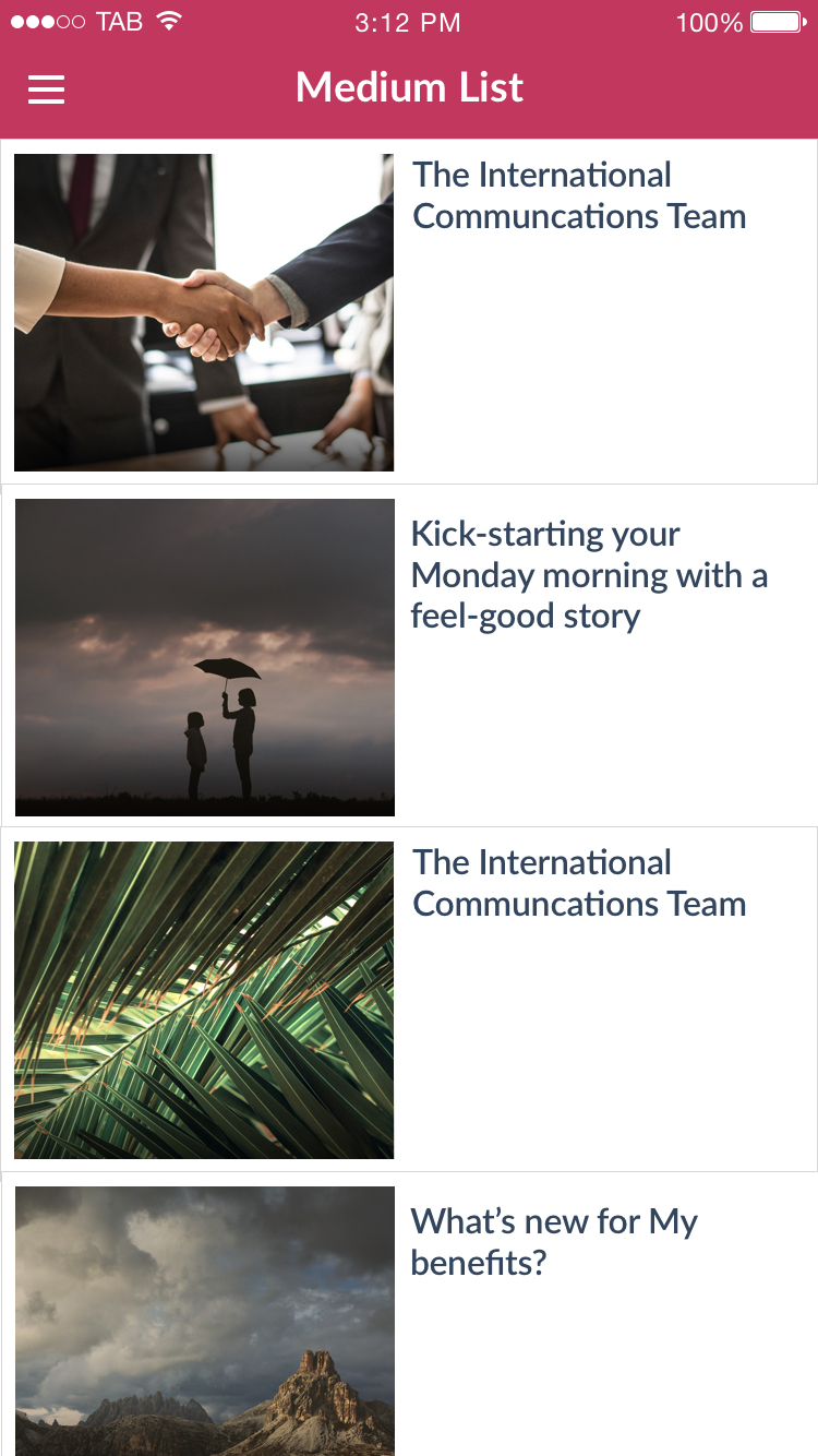
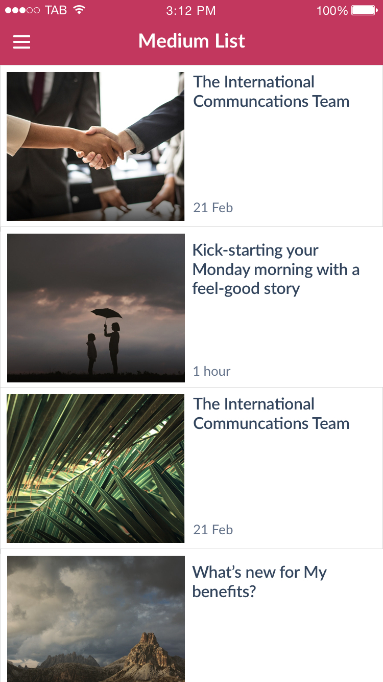
Just titles (left) Titles & time stamps (right)

Titles & Icons (left) Titles, icons and time stamps (right)
Feed List
Feed List presents list items and with an icon and the list item title. The icon used represents the type of content within that list item. Feed List is best suited to lists which have lots of files, images and videos for download.
Time stamps can be enabled with this list layout. Gradients and icons are not available with this list layout.
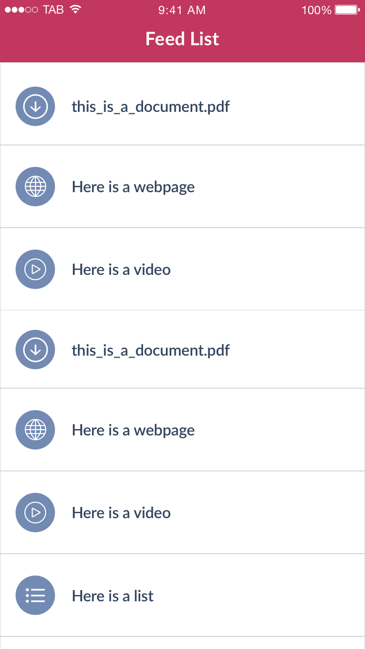

Just titles (left) Titles & time stamps (right)
Gallery List
Gallery list is the most visual list of all. It displays list items as a grid of images, like an image gallery therefore is best suited to good quality imagery. There are no list item titles displayed with this list layout.
Gradients and icons can be used with this list layout. Time stamps cannot be enabled with this layout as each list item is displayed quite small.


Icons disabled (left) Icons enabled (right)
Letterbox List
Letterbox layout presents list items 1 per row. It is similar to large mag only it has spacing around it. Letterbox List is most suited to good quality imagery. It is a very visual layout.
Use of gradients with icons
When icons are enabled with this list layout, gradients are automatically enabled to the top and bottom of the featured image. This is so the icon can be clearly seen against the featured image.


Just titles (left) Titles & time stamps (right)

Titles & Icons (left) Titles, icons and time stamps (right)
2 Column List
2 column list layout presents list items 2 per row. It is similar to small list only it displays titles and time stamps beneath the featured image.

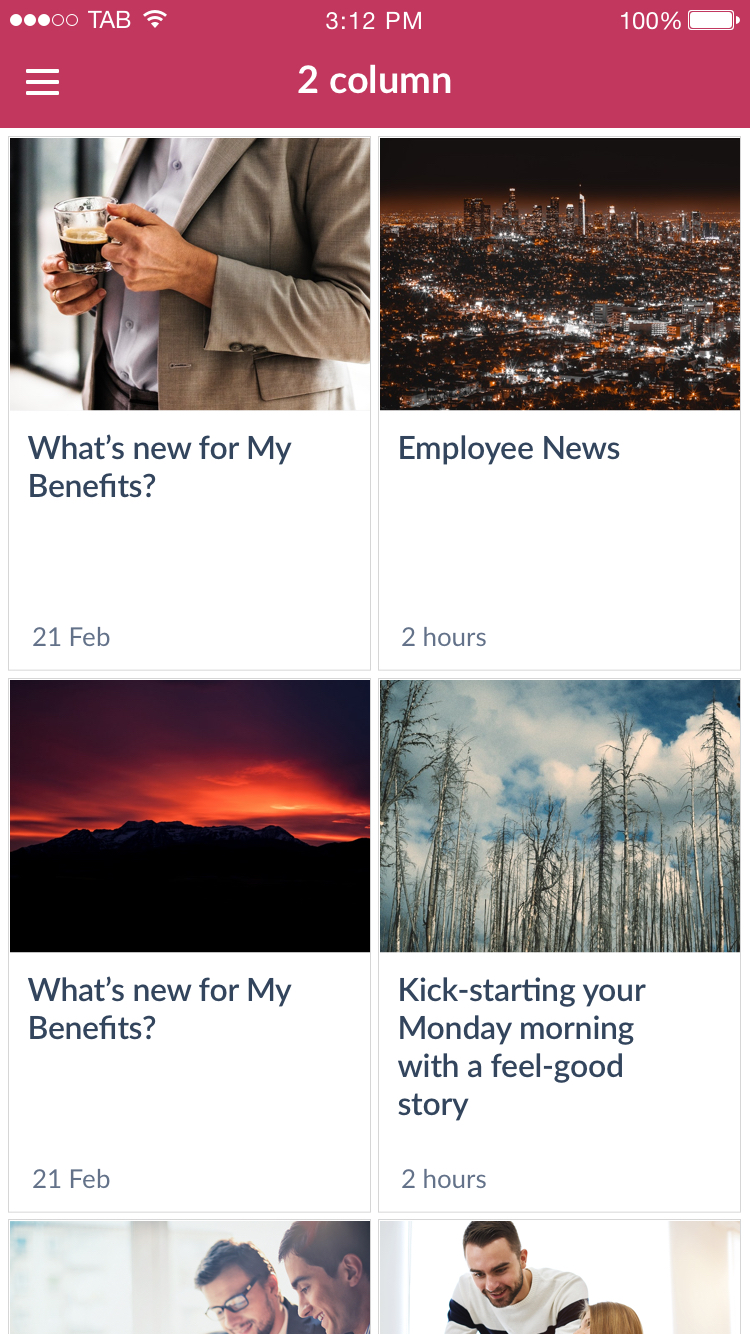
Just titles (left) Titles & time stamps (right)
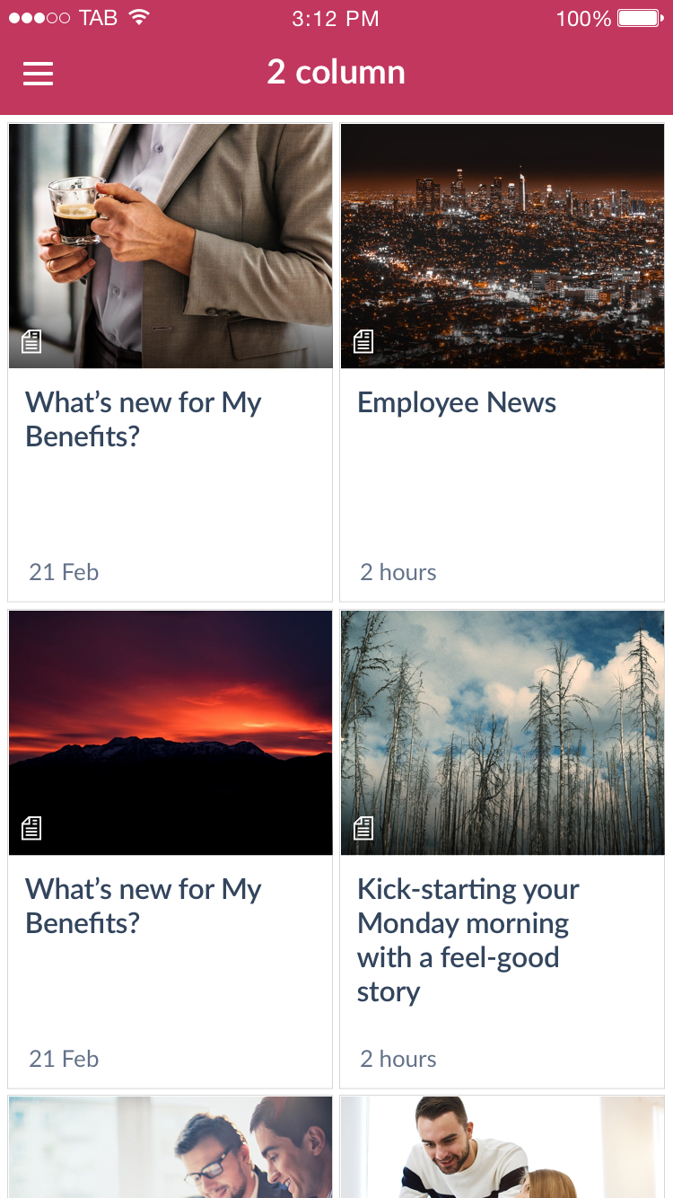
Titles & Icons (left) Titles, icons and time stamps (right)