Page Layouts
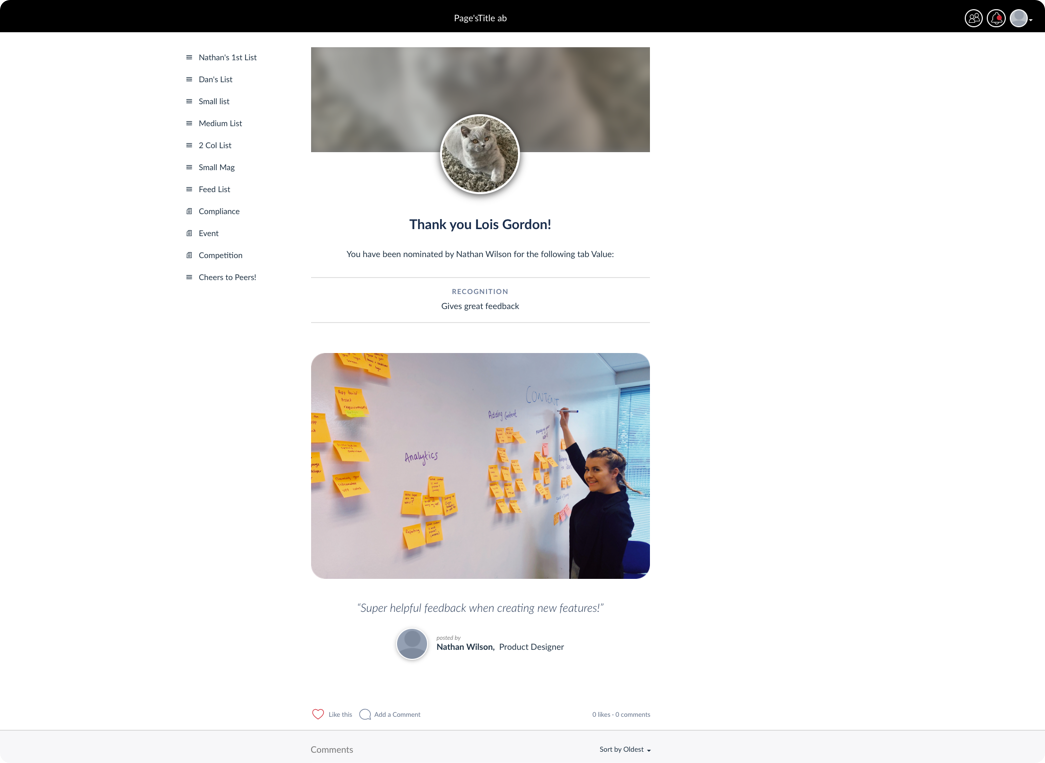
White there are various screens and content types displayed within the webapp, the pages should retain the same look and feel. A grey (#F9F9F9) background is shown on the main body of the page. The main content stands out as it should be presented in single white container or multiple white content containers with grey borders (#EBEBEB).
The main content area should be contained to 705px wide maximum, and should be in the centre of the screen.
Modular Pages
For example, content within a modular page is kept within a white container with a light grey (#EBEBEB) border. Images within the container fill 100% of it’s width, but text content should not reach the edges, as there should be padding left and right of it so it only fills about 85% of the container. For desktop sizes this padding is 44px left and right.

Recognition page in the web app
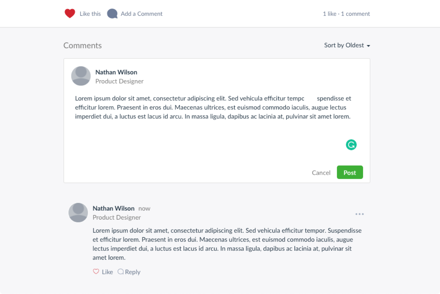
The social action bar is shown at the bottom of the white container to signify the bottom of the page. Comments are displayed below this container on the grey background.

Comments displayed on a modular page
Notification Centre
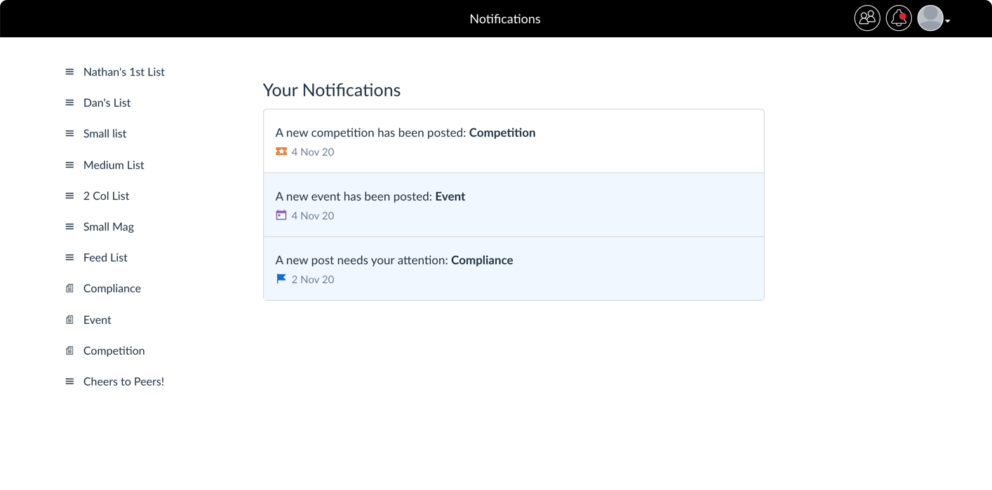
The notification centre screen shows individual notifications in their own white container divs. Again these will be displayed in the middle of the screen horizontally and should be no more than 705px wide.
The title of the notification centre should be at the top of the list of notifications, placed on the grey body.

Notification centre in the web app
Responsive Design
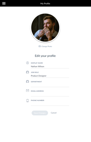
Note that the webapp should be fully responsive and content should fit well in any size of screen and provide a comfortable reading experience. The elements should adjust to each screen size, maintaining aesthically pleasing levels of spacing and suitable typography size. Below is an example of a screen within an iPad, showing a contact widget. Elements have been adjusted in size to account for the lesser precision level of touch interaction versus using a mouse. A nice level of padding has been maintained around the main content div and inside it.

Spacing and typography should be adjusted to comfortably fit smaller screen sizes