Navigation
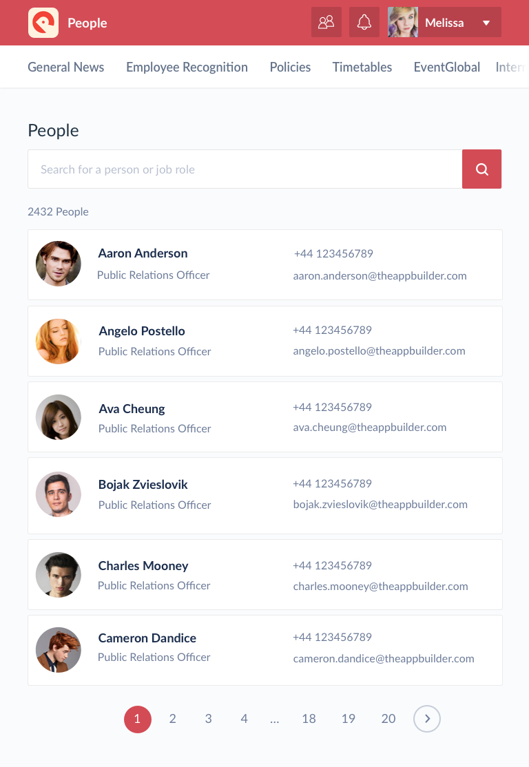
The web app navigation is found at the top of the screen, as it displays a title bar and the main menu underneath.
The title bar contains various elements:
- Organisation’s app logo
- Name of the app
- Title of the current page
- Notifications link
- People Directory linked (optional)
- Account dropdown (with links to profile, app library, settings and logout)
The title bar should be the brand colour as set by the App Editor in the CMS. Depending on whether the colour is light or dark, the text and icons can be either white or black. The backgrounds on the buttons for people directory, notifications and account should be black at 13% opacity with a 2px radius on the corners.

The webapp navigation
The app’s primary navigation is found horizontally placed along the top of the screen, under the title bar. The main menu bar should be responsive, showing as many menu items as possible on the screen given that there is adequate space to display them. The main menu items are scrollable left to right, so if the screen isn’t large enough to comfortably present all of the menu items, the rest are hidden to the left of the screen, but the user can scroll through these.
Tablet Navigation
When using the webapp on a tablet device the content should adjust to fit the smaller screen, including the navigation bar. The white horizontal bar should stay in place, and the menu items should display along this bar like the desktop design. Less menu items will be in view on a tablet in portrait mode since the screens are typically smaller, however the user can pull over more items from right to access them. A white to clear gradient should be shown in the horizontal bar, overlaying the menu item links to indicate there are more links beyond the view. This should also be present on the left side too.

The tablet navigation
Mobile Navigation
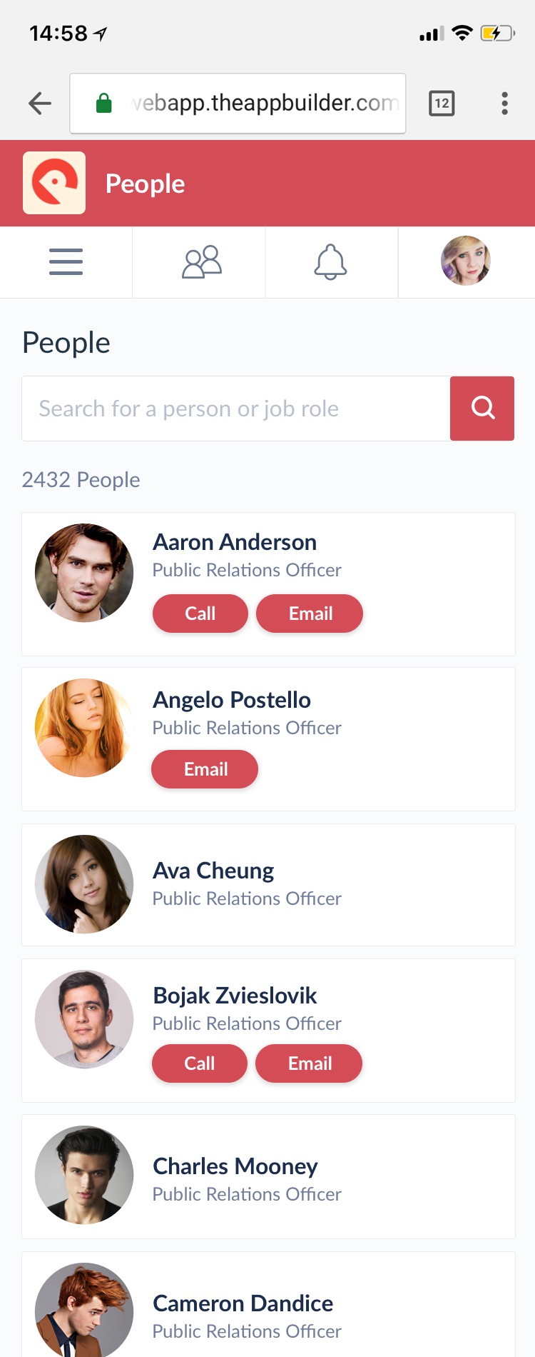
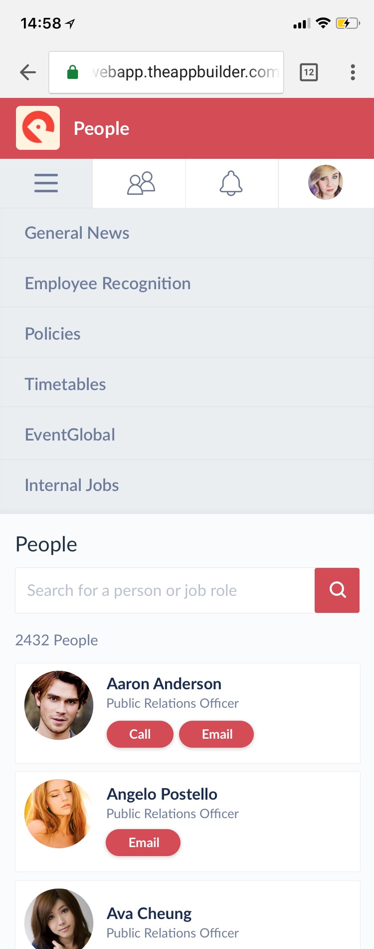
When the webapp is viewed on a mobile screen the entire top area of the webapp is presented differently. The main menu items are accessed via the hamburger icon at the top, as tapping this icon will reveal the menu links. Links for the people directory and notification centre are also displayed along this bar. The last item along this bar is the user’s profile picture which will present links to the user’s profile, settings, the app library and the option to logout when tapped.


The webapp shown on a mobile phone with the menu open and closed