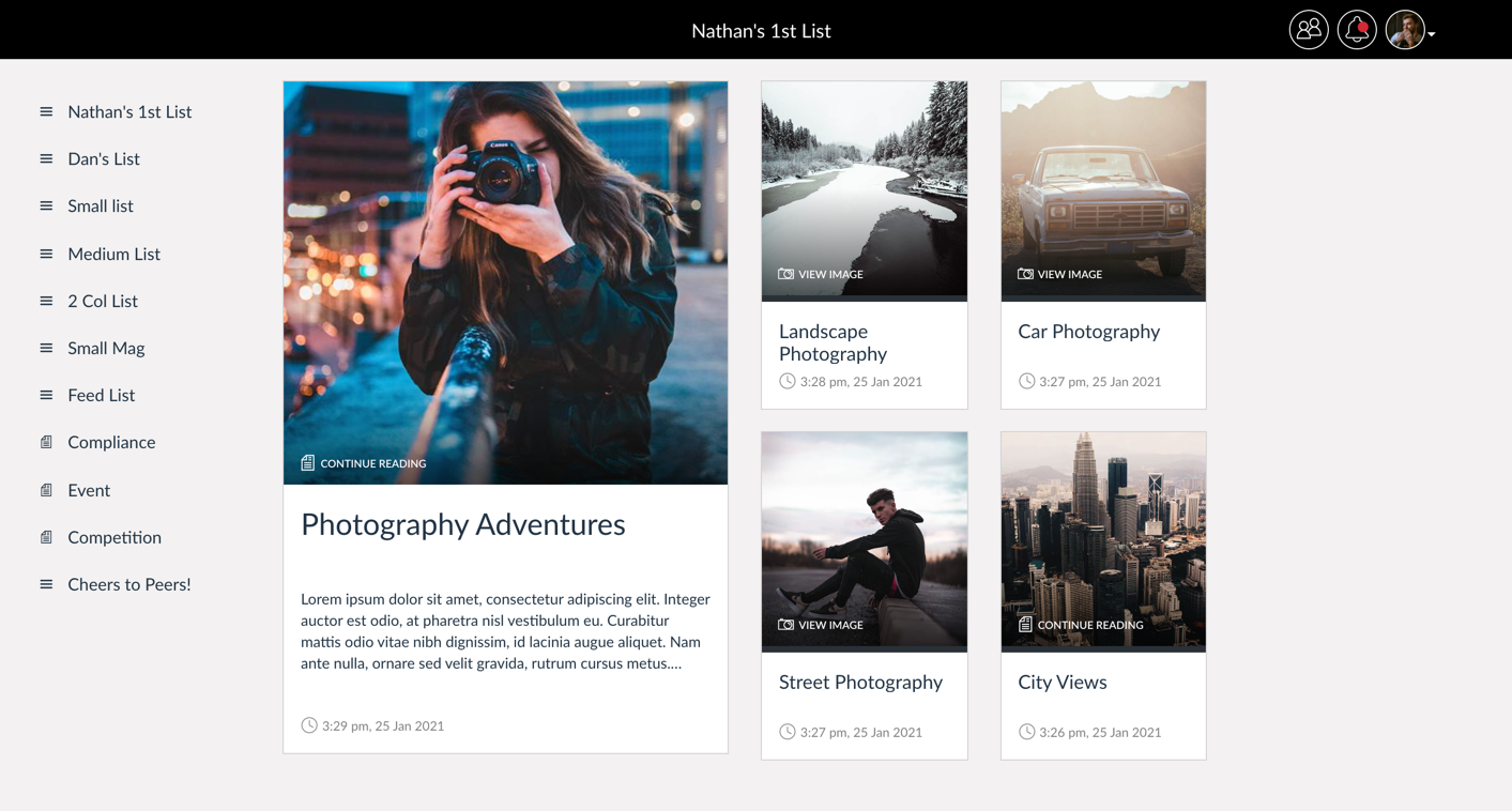
List Cards
App Editors can create lists within their apps that house various kinds of content, including modular pages, videos, images and other lists. In the CMS the App Editor can select a layout to determine how these list items appear in the end user’s phone or tablet. However, the webapp uses a single layout - a grid of the list items presented as cards.

The list cards are made up of different elements:
- Featured image
- Content title
- Content type icon and text (optional)
- Number of likes (optional)
- Number of comments (optional)
- Post time
- Coloured border (uses brand colour set in CMS)
-

View List
Recognising fellow employees for our EA Gala
98 23 42 mins -

Read
Recognising fellow employees for our EA Gala
98 23 42 mins
Hero List Cards
If the App Editor has chosen to include a “hero item” in their list the top item is shown as a large tile at the top on native devices. In the web app, these hero items are shown as large list cards. The difference with these hero list cards is their size and that they include an excerpt of text if the content they represent is a modular page containing text. These larger hero cards will always be presented first in the list.
-

Open Document
How one department climbed to the peak to become a better team
Sed haec quis possit intrepidus aestimare tellus. Morbi fringilla convallis sapien, id pulvinar odio volutpat. A communi observantia non est recedendum…
98 23 42 mins