Buttons & Links
Buttons are found throughout the webapp to indicate the primary action a user can take on that screen, for example, thanking a staff member or completing a step of the onboarding process.
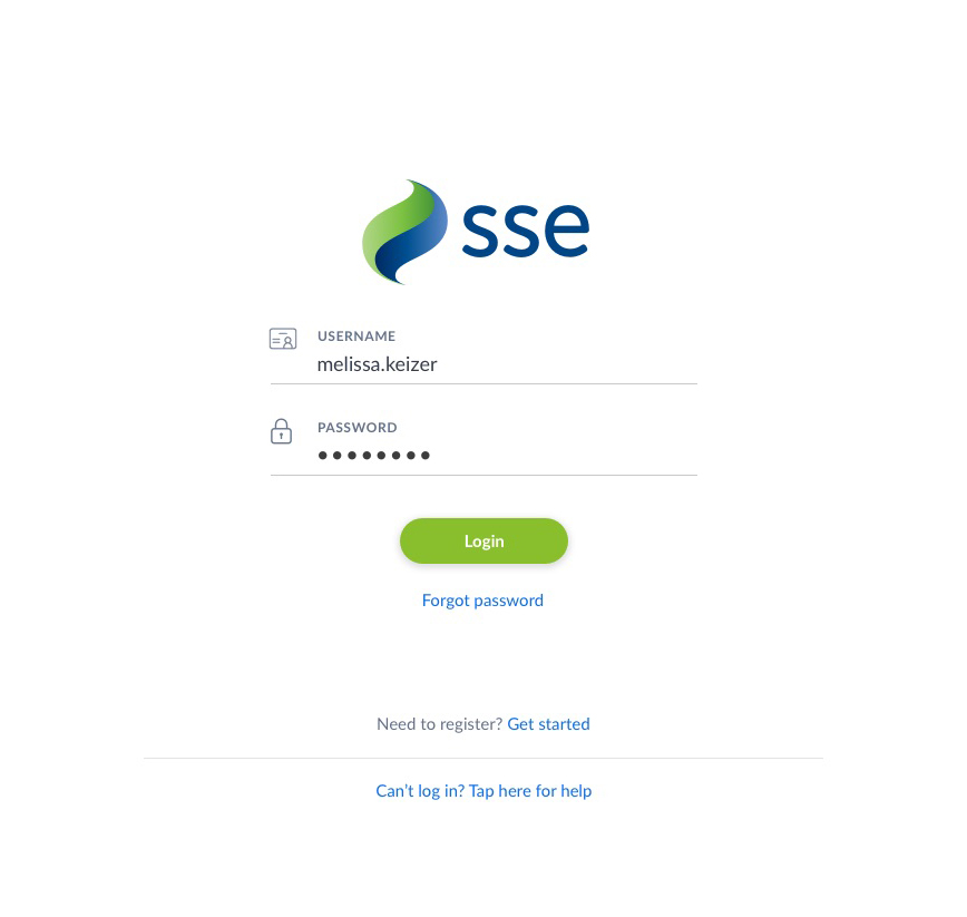
The buttons are round, lozenge shapes and should take on the brand colour as set by the app editor. Depending on the lightness of the colour, the button text can be white or black. If no brand colour is the base colour should be blue (#106DE0) with white text.
Primary Buttons
The primary button should be 40px tall with 44px of padding applied to the left and right of the button text. The active state of the button has a box-shadow. Upon hovering over the button the background colour should be lighter (using Sass’ lighten function to lighten the colour by 5%). When the user clicks the button the box shadow is changed to look like the button has been pressed.
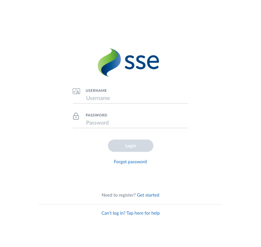
The disabled state of the button is always the same, it appears as light grey with white text and no box shadow.
Buttons with Icons
Another button variation is the button with an accompanying icon such as the Download Contact button found on a contact widget. Its hover and pressed states should follow the same pattern as the primary button style.
Primary Button and Secondary Option
Users are often presented with 2 options shown in the format of a primary button and a secondary action shown as a basic link below. The hover state for these basic links is a bottom border.


Buttons presented on the onboarding screens, shown inactive and active when form is filled