Search
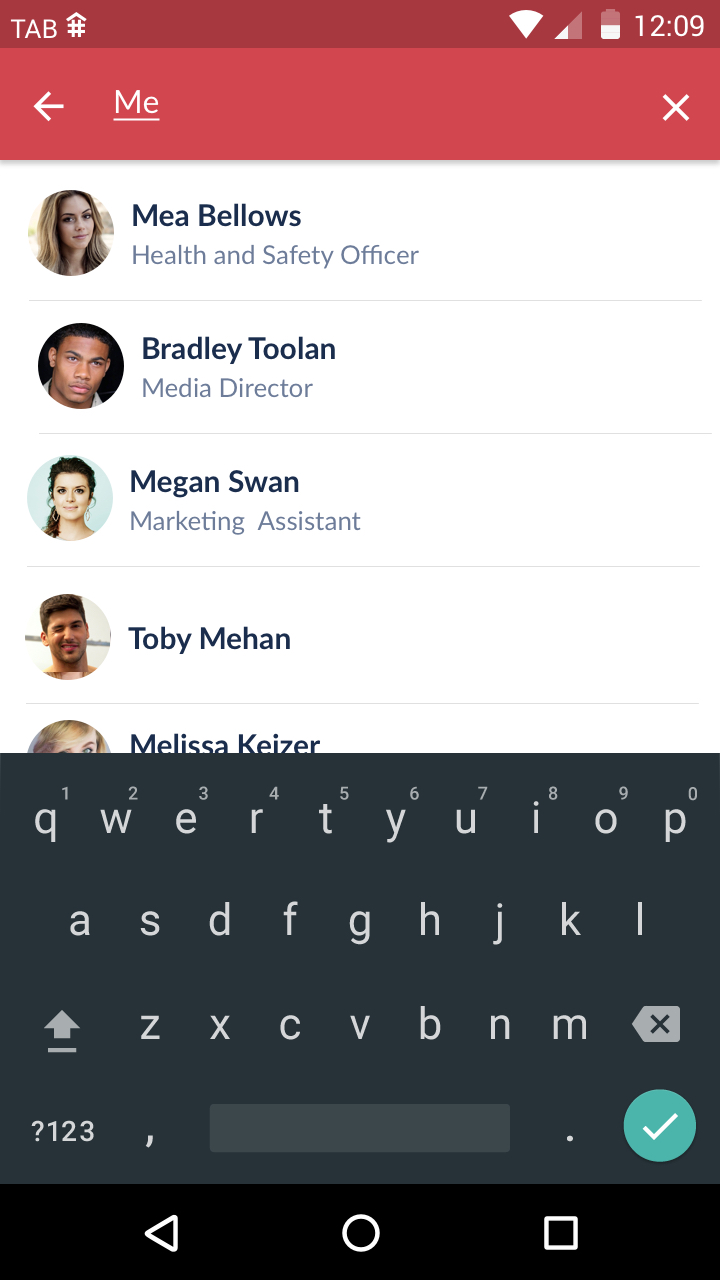
Search functionality is employed in TheAppBuilder mobile apps in the People Directory. When performing a search in Android the user must press the search icon in the top right corner. The title bar then changes into a search bar, with a back button and placeholder text in the search input field. The keyboard slides up allowing the user to begin typing and list of people is filtered as characters are entered.


Performing a search for users in the Android app
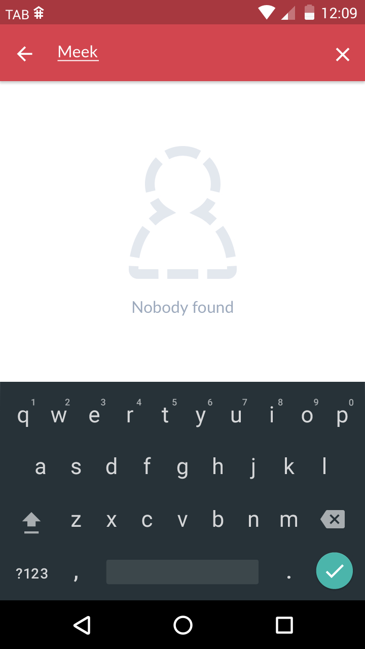
Filtered search results (left) and no results found
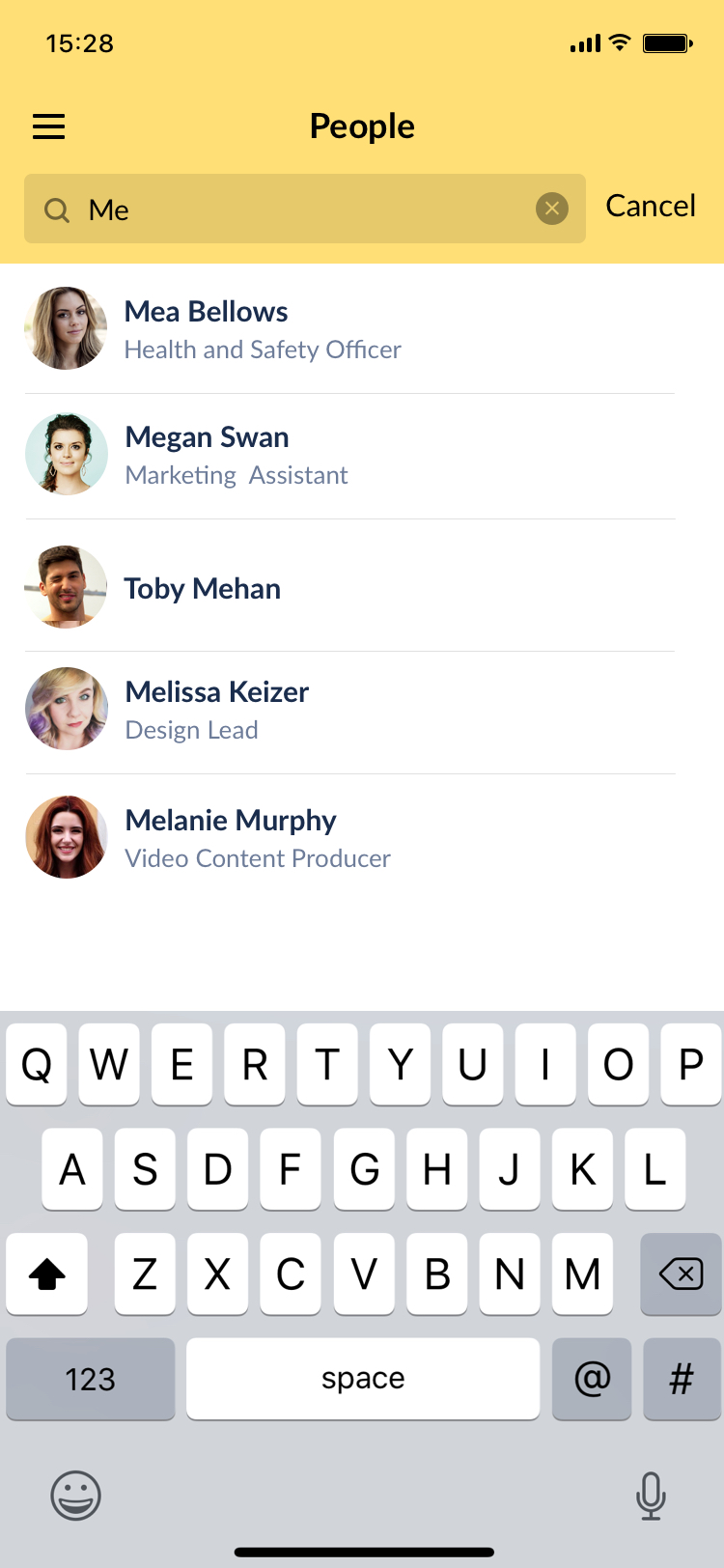
On iOS devices the search field is always present on the people directory list. The search box will highlight and the cancel button will then appear next to the searchbox when the user taps into it to type their search query. Similar the the Android behaviour, the list of people is filtered as the user types character into the search box.
If no results match the search criteria the screen should show the "Nobody found" text and accompanying icon.

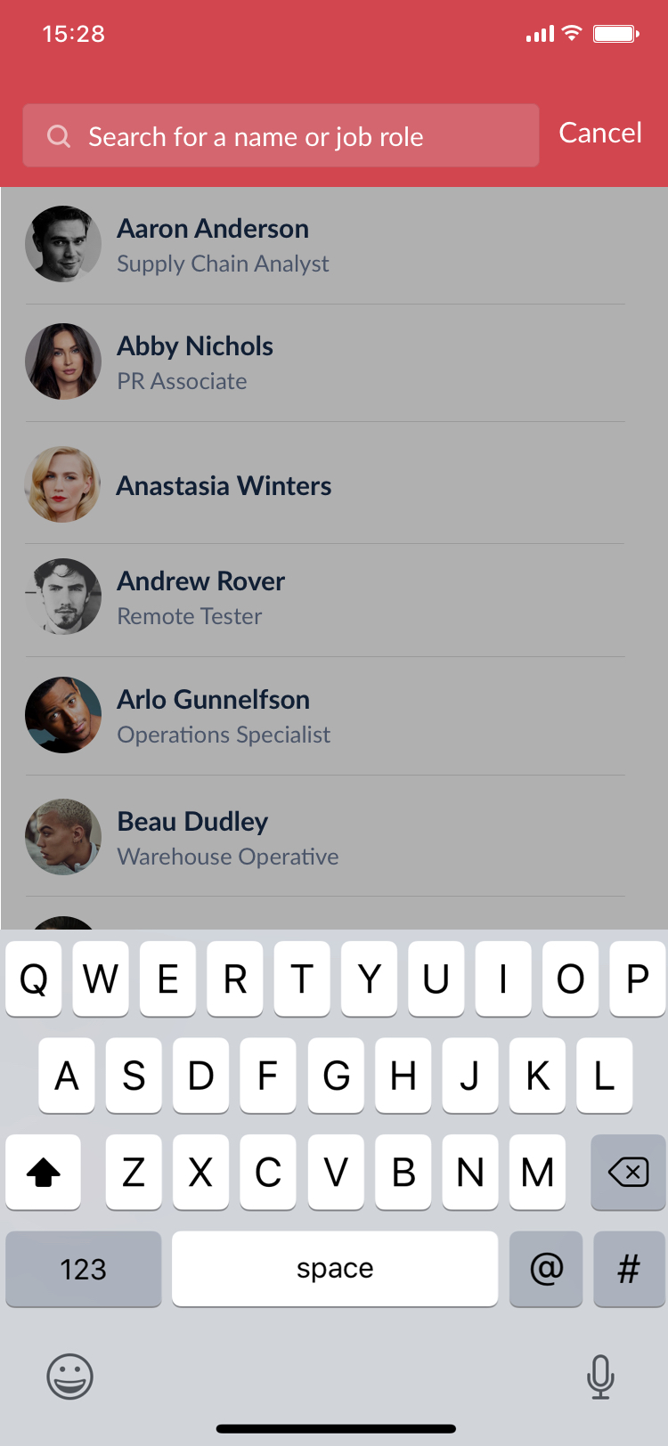
Performing a search for users in the iOS app - search field highlights and background dimmed before characters are typed into the search input
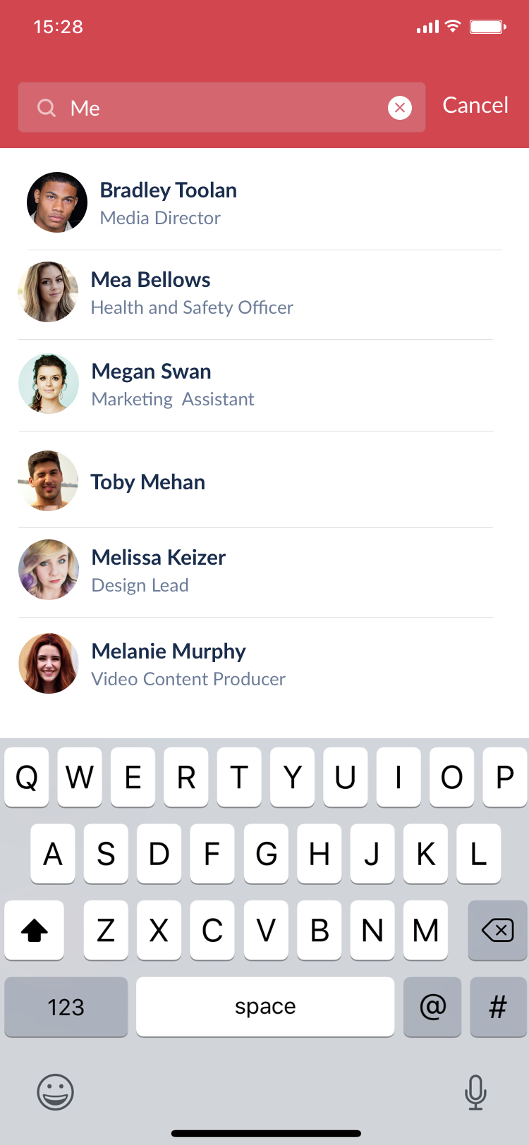
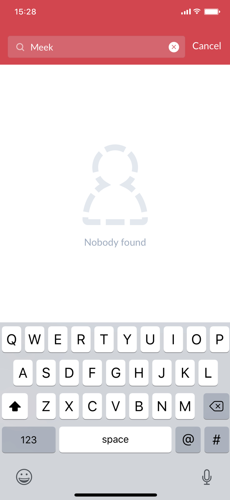
Filtered search results (left) in iOS and the screen for no results found
Colour in Search Bar
As mentioned in the Navigation section, the colour of the text and icons in the title bar depend on the background colour set by the App Editor. However there are additional elements to consider for the search bar.
In iOS the searchbar background should be black at 10% opacity. The placeholder text should be the same colour as the title text (white or black) at 50% opacity, while the input text the user enters should be this colour at 100% opacity. The cancel text should also be the same colour as the title text, at 100% opacity.
The searchbar also contains a search icon that is placed inside the search input. Again, the colour of the icon selected (white or black) is dependant on the background colour of the title bar. This icon should be set to 50% opacity at all times.

The colour of the search bar text and icons are also dependant on the titlebar colour