Error Handling
Error alerts are used to show users errors they have made when filling out forms in the app.
Error Alert Placement & Design
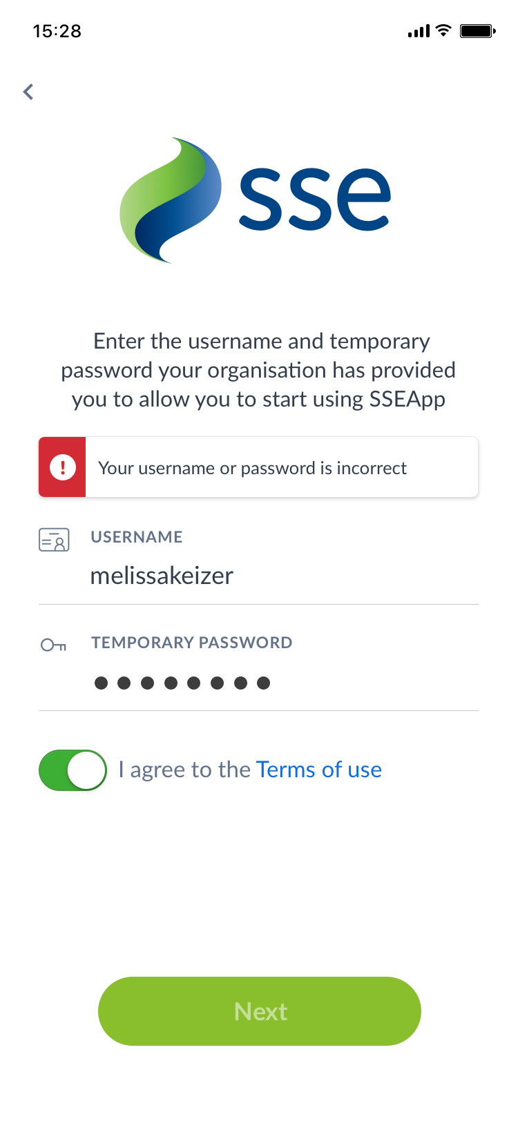
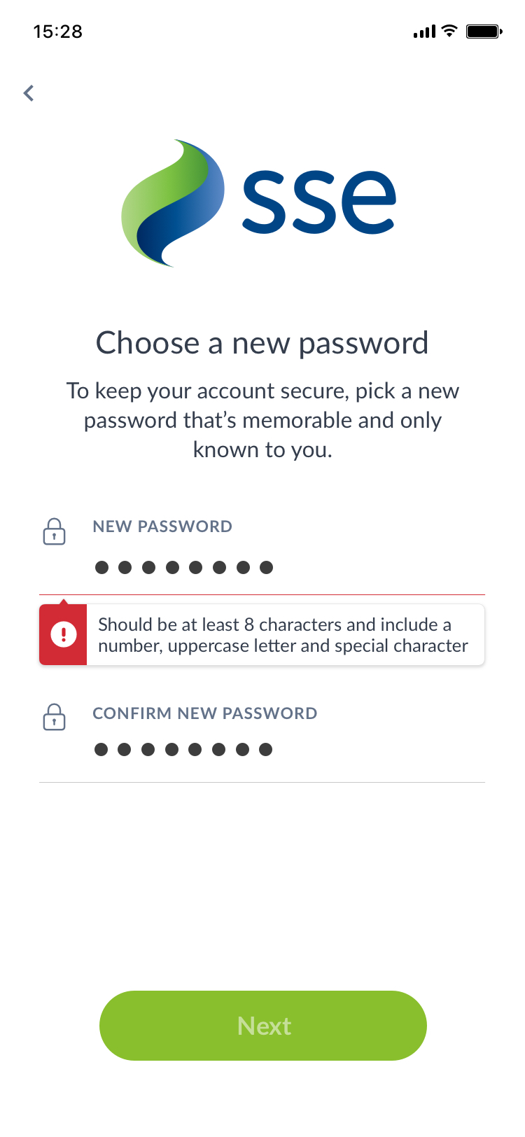
If the error is relevant to one specific field it will appear under the field in question with a small arrow pointing up at it. If it is a more generic error, for example if a user's username/password combination is incorrect, the error alert will appear at the top of the form with no arrow.


General error (left) and specific field error
Error Behaviour
The following steps out the behaviour of the error alert and button states as the user interacts with forms in the native client.
Error messages will persist
This is so users can refer to the error at anytime. For example, if a user chooses a new password that does not fit the requirements, they will see an error upon submitting the form. This error will stay on the screen as they fill out the form again, so that they can refer to the guidance the error provides.
Buttons will be inactive until form is filled
The form button will be inactive upon visit to the form and will remain inactive until fulfilment of the form requirements so that we can guide the user through the form requirements, without the need to indicate required fields in the UI.
Button spinner should appear for 400ms upon press
The button should show a spinner for a minimum of 400ms upon button press to act as feedback to the user that their input has been accepted and is processing.
The button should remain active after form submission
If the form has been filled out correctly the button will remain active after the user submits the form. This is because if the error is with a problem with the server for example, and the user has entered 'correct data', the user doesn't/shouldn't have to take corrective action within the fields if the issue is not with their data.