Navigation
Colours
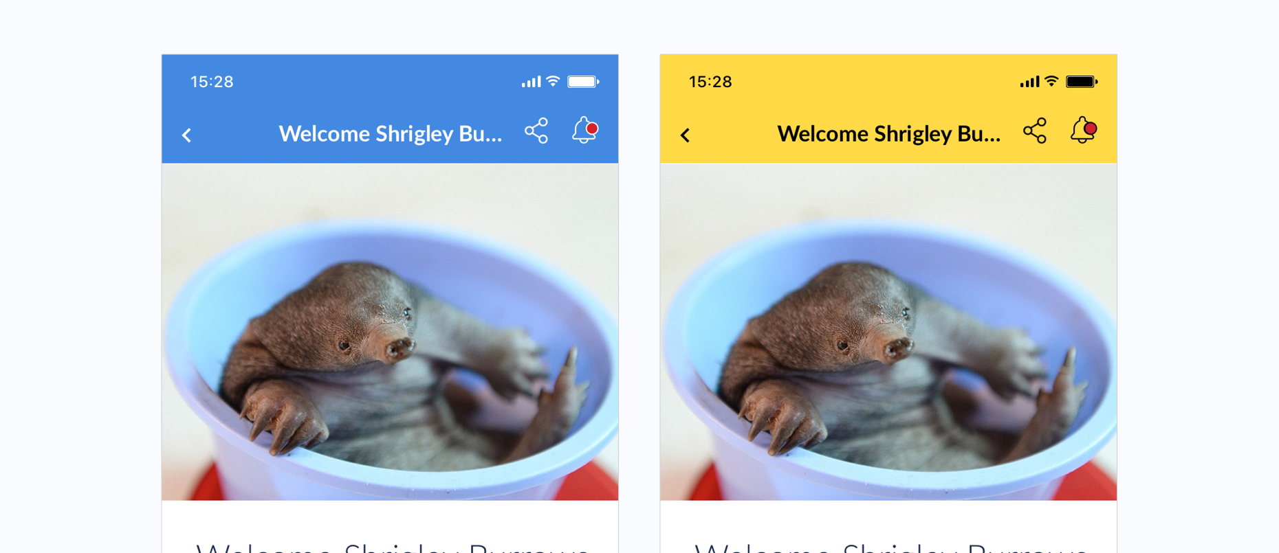
Since the background colour of the title bar can be any colour specified by the App Editor, the overlaid title text and icons must be adaptable.
We export 2 versions of each icon that are displayed on the title bar, a light version (white) and dark version (black). A specific colour algorithm to identify if the background colour is considered light or dark, enabling us to choose whether black or white text/icons would be more suitable the app.
The colour of the status bar will also change according to background to colour on iOS, but status bars on Android should not affected.

The background of the title bar determines the text and icon colour
Title Bars
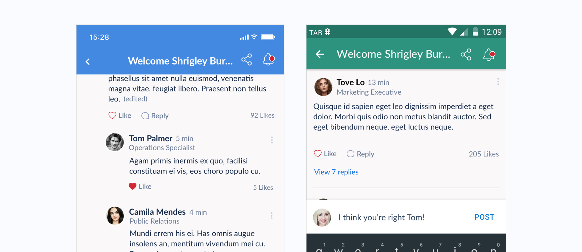
While most of the UI in the mobile apps remain identical, there are some elements which are specific to their operating system. This includes back buttons. Both iOS and Android use their default back arrows which looks distinct.
The placement of the title is slightly different on the operating sustems too as iOS centers titles but Android places titles more to the left side of the titlebar. Icons in the titlebar should be right-aligned.

Back arrows and the placement of titles differs in iOS and Android