Modal Types & Mapping Modals Cross Platform
Modals, or Dialogs, appear in front of app content to provide critical information or ask for feedback from a user, such as a decision they have to make. They disable all app functionality when they appear, and remain on screen until confirmed, dismissed, or a required action has been taken. Since modals are purposefully interruptive they should be used sparingly.
The language used in modals or dialogs should be direct and focused, but desciptive enough to avoid any ambiguity. The messages should only be one or two line longs and sentence-style capitalisation should be used.
iOS Modals
Alerts
Alerts are used to convey information that requires feedback from the user. An alert consists of a title, an optional message, one or more buttons, and optional text fields for gathering input. In most cases two-button alerts should be used to provide users with an easy choice between two actions. Confirming buttons are used to accept and continue with the action, for example, "Ok" or "Send Report," and dismissive buttons should be used to cancel the action. When user acknowledgement is required to proceed, a single action may be presented, for example, a single button with the word "Ok."
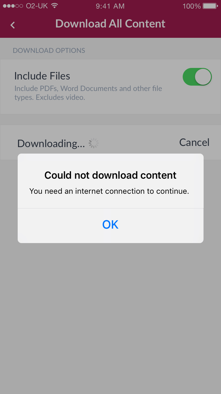
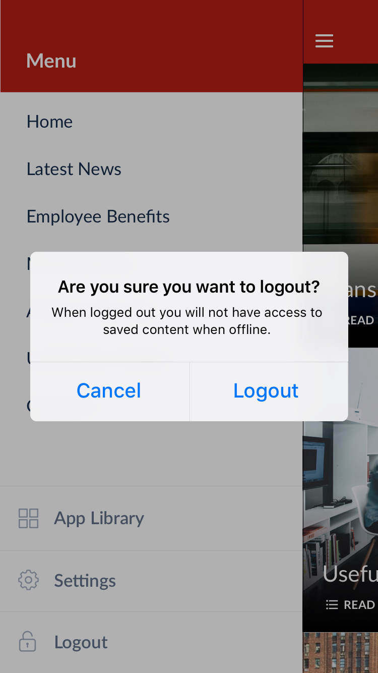
Alert with a single action requiring a user to confirm acknowledgement (left), Alert with a cofirming and dismissive action
Action Sheets
An action sheet presents a set of two or more choices related to the current context. Use an action sheet to let people initiate tasks, or to request confirmation before performing a potentially destructive operation. Cancel buttons should always appear at the bottom of the screen and destructive or dangerous options should be at the top, coloured red.
On smaller screens, an action sheet slides up from the bottom of the screen. On larger screens, an action sheet appears all at once as a popover.
Activity View
An activity view shows actions that are relevant to the current context. For example, the actions available for a piece of content include adding a bookmark, copying a link or saving image. We use the Activity View to show sharing options on a shareable piece of content within the app.
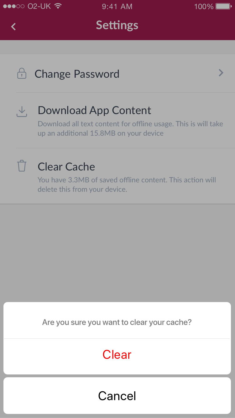
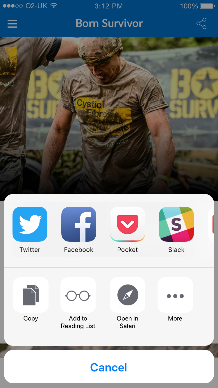
Action sheet used to clear cache (left), and Activity view in iOS used to show sharing options on a modular page
Popovers
Some modals will appear as Popovers on iPads since they have larger screens and this type of modal is usually larger and more complex that other modals used in iOS. They can contain a variety of elements such as navigation bars, tab bars, images, maps etc, and will generally have an arrow pointing to the location from which it emerged.
Android Dialogs & Components
Dialogs are made up of a container, title (optional), supporting text and action buttons. When a dialog is on screen the rest of the UI is inaccessible and the rest of screen behind is dimmed down, or "scrimmed." Titles should be a brief, clear statement or question and should avoid ambiguous questions such as "Are you sure?"
Action Buttons
The dialogs should also contain two action buttons side by side; one confirming button to accept and continue with the action displayed right, and the dismissive action to cancel displayed left. However in stacked full-width buttons can be used to accomomdate longer button text. When these are used Confirming buttons should appear above dismissive actions. Buttons can also be neutral, for example when a user does not want to proceed with the action, but doesn't necessarily want to cancel. It appears between the positive and negative buttons. For example, the action might be "Remind me later."
Confirmation Dialog
Alert dialogs interrupt the user with urgent information, details, or actions and the user must select one of its actions to close it.A Confirmation dialog is a type of Alert Dialog that requires users to confirm a choice before the dialog is dismissed.
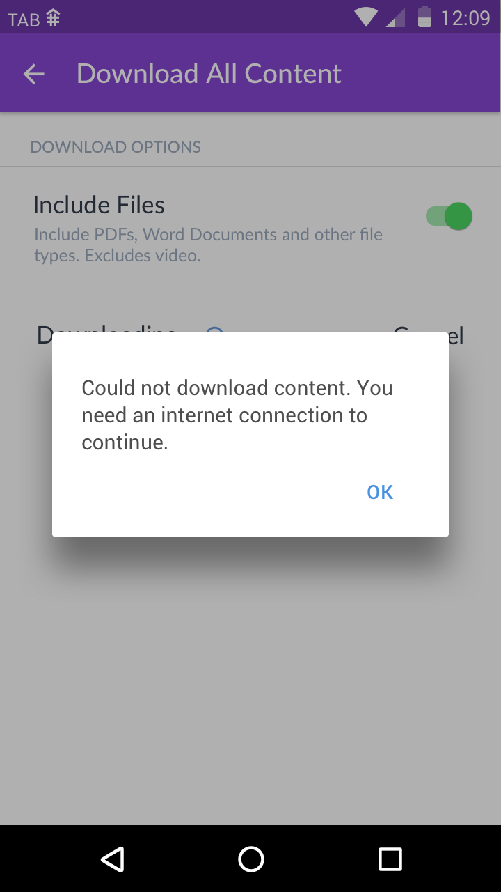
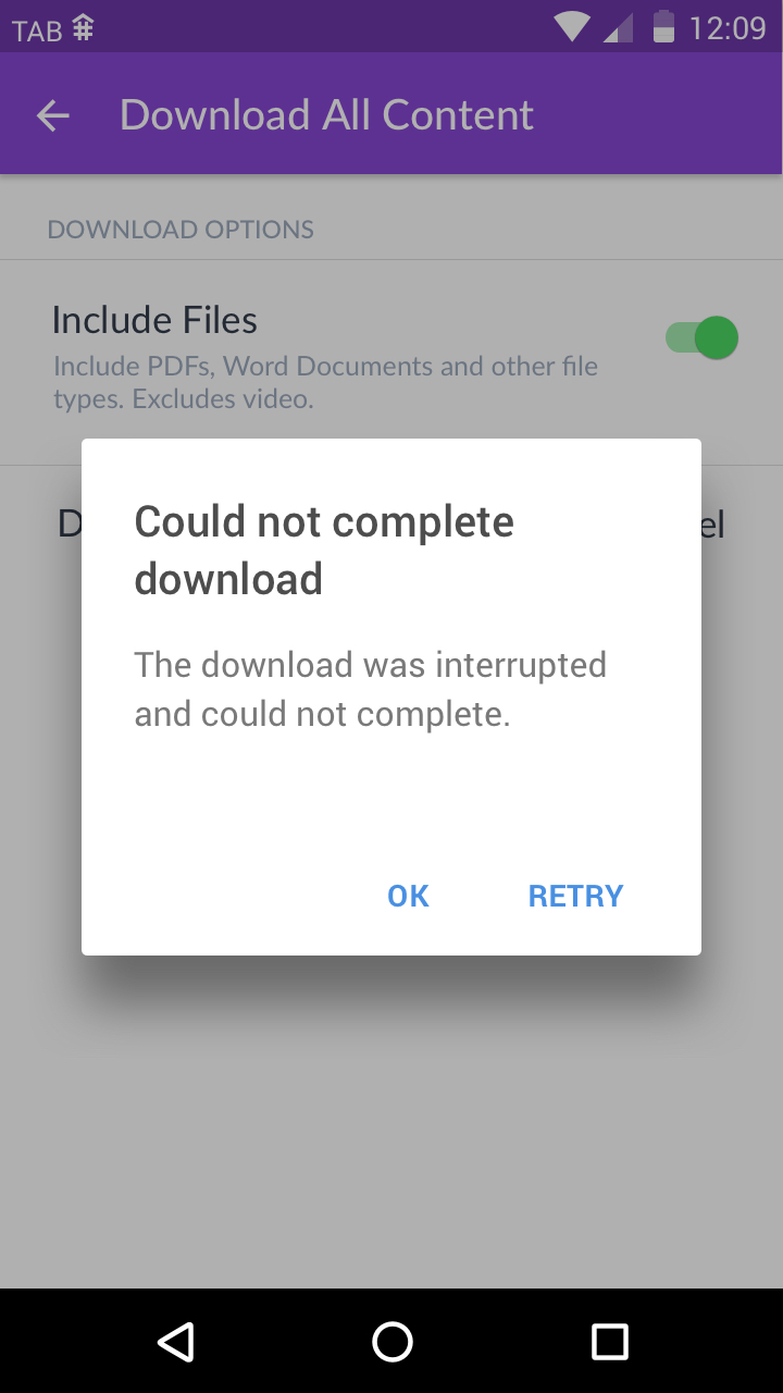
A confirmation dialog with one option requiring user acknowledgement (left), a confirmation dialog with a confirming action and dismissive action
Bottom Sheets
In order to display the external share options we make use of Android's expanding bottom sheet component, which appears from the bottom of the screen when the share icon is tapped. The sheet can be pulled upward to reveal more share options.
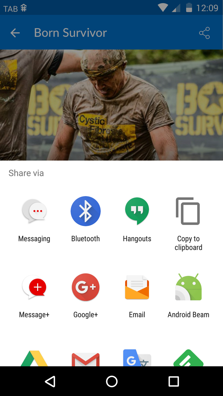
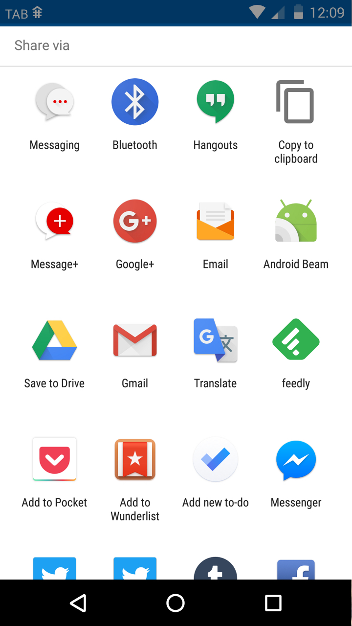
An expanding bottom sheet used for external sharing in Android
Destructive Buttons
It is important to identify dangerous or destructive buttons to users by using red text to highlight the button, rather than the standard blue button colour as this warns the user and encourages them to think if this action is definitely one they want to go through with. For example, actions such as "Clear Cache" and "Delete" should be highlighted in red when presented in modals.
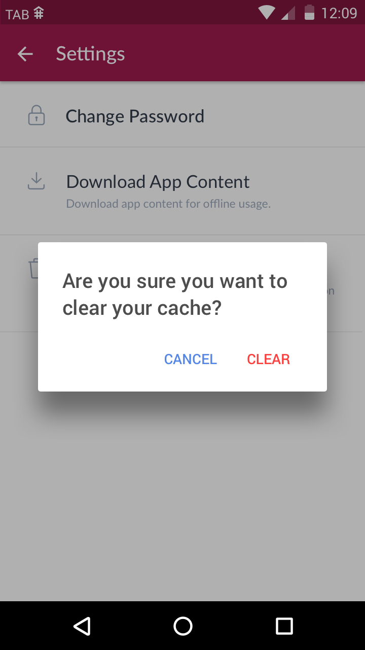
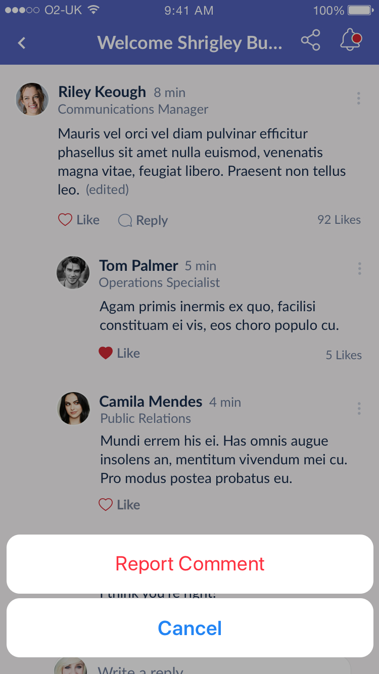
Potentially dangerous or destructive actions such as clearing the cache or reporting a comment should be highlighted with the red colour
Mapping Modals in iOS and Android
When creating interactions in our mobile apps using Xamarin we can call a modal type that will display a certain alert on iOS and a certain dialog in Android devices. Below is a list of modal types we generally refer to at TheAppBuilder and how they should look in each operating system.
Dismissive Alert
These should call an iOS alert and Android dialog with a single action button. Often this action is OK. Note that when only one sentence of text is required in an alert iOS should show it as title text but Android should show it as paragraph text.
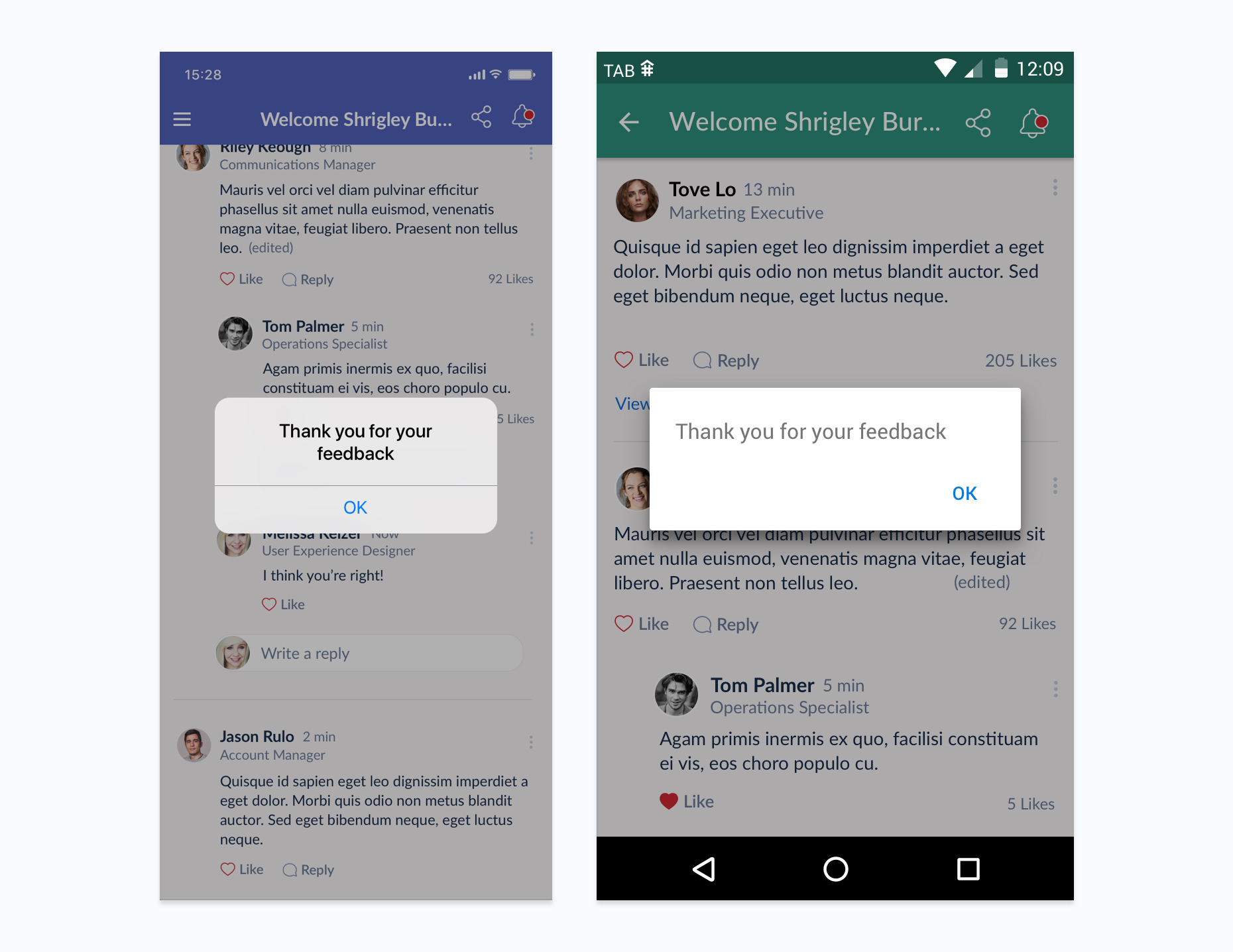
Dismissive Alerts show only one action button
Standard Alert
These should call an iOS alert and Android dialog with two action buttons, one confirming and one dismissive. Often these alerts will contain both a title and paragraph text. Note that the optional text type is different in Android and iOS. If only a short sentence is needed for the alert it should be styled as a title in an iOS alert, while it should be styled as paragraph text in the Android dialog with no title.
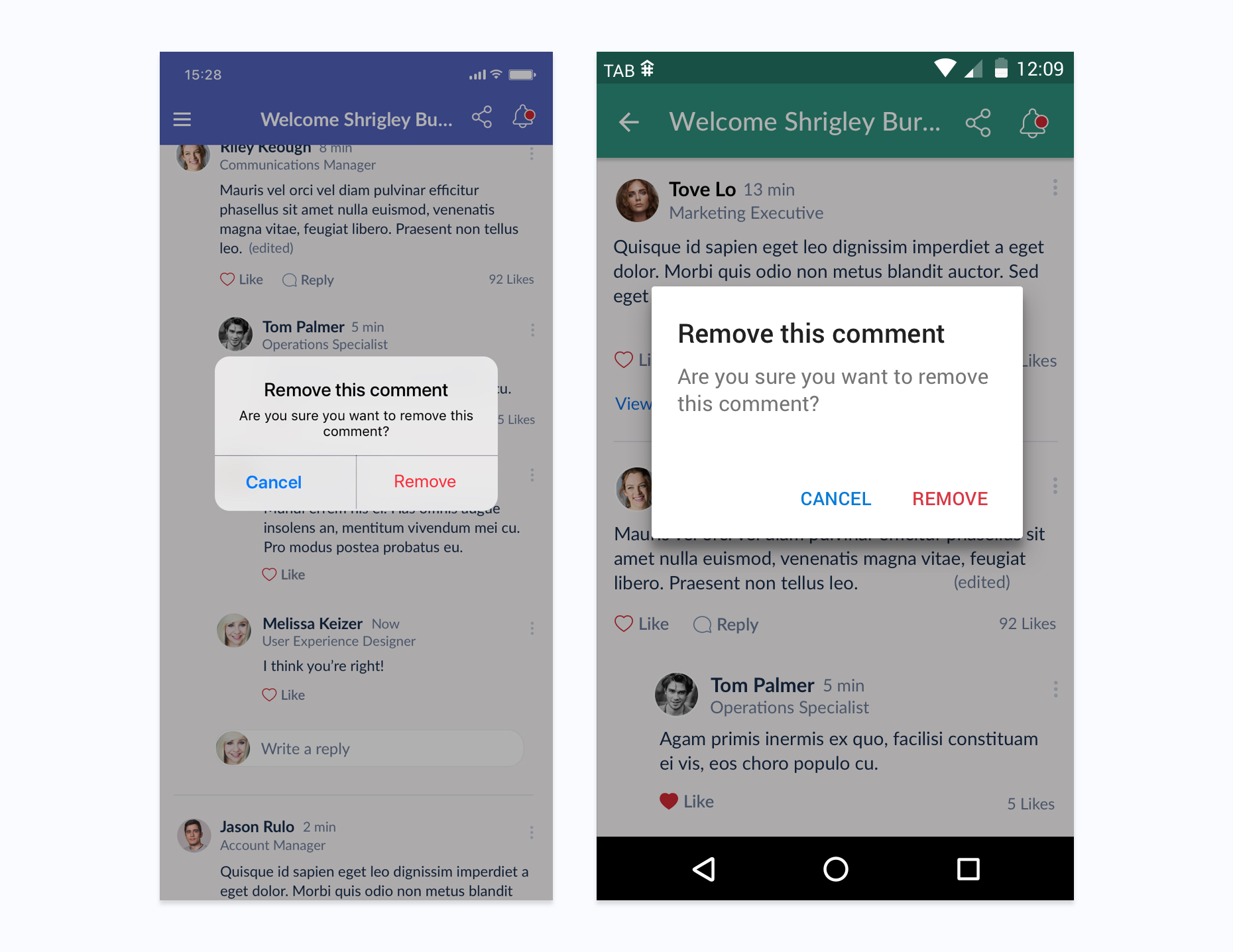
Standard alerts show two action buttons - one a confirming action, one dismissive
Multiple Action Alert
When more than two action buttons are needed multiple action alerts can be called. Buttons are vertically stacked in these type of alerts.
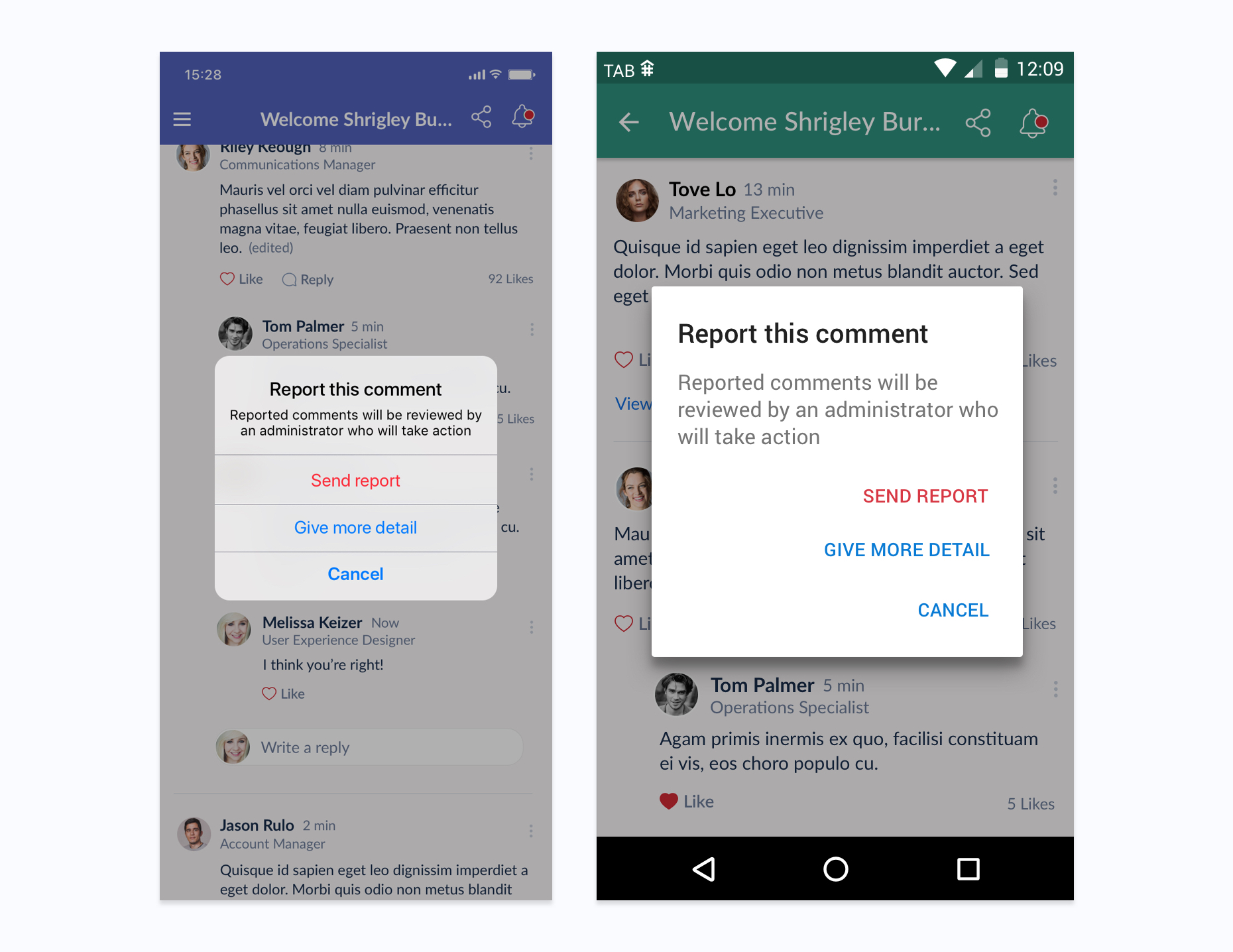
Multiple action buttons can be displayed in an Multiple Action Alert
Context Menu
Options related to a particular context of a page or section are often called with Context menus, for example when accessing interaction options for a comment.
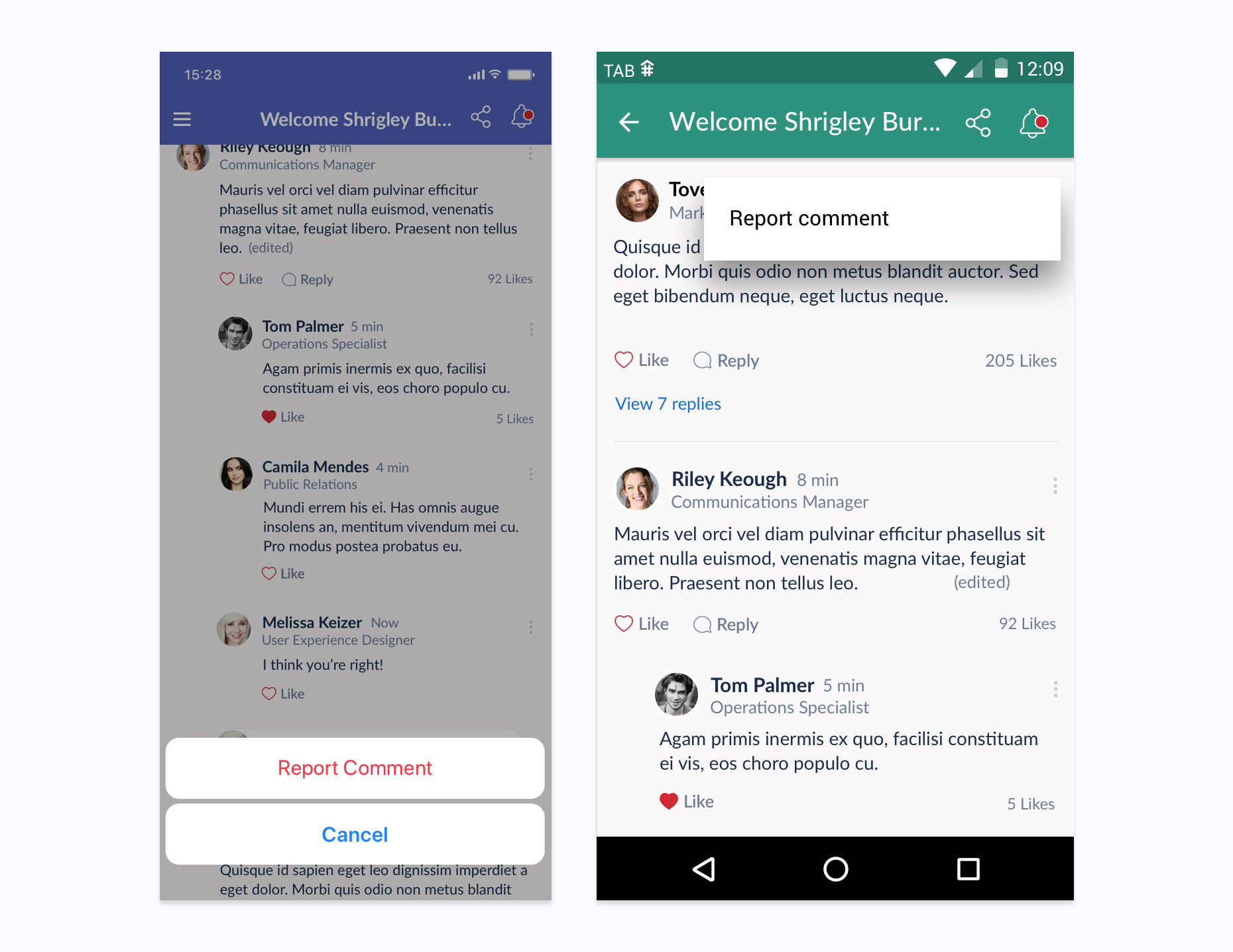
Context menus call iOS action sheet and Android context menu
Alert with Input
When a user needs to input their own text they can call an alert with an input field (containing placeholder text). These should also have a confirmation action and dismissive action. Note that iOS input alerts do not have titles.
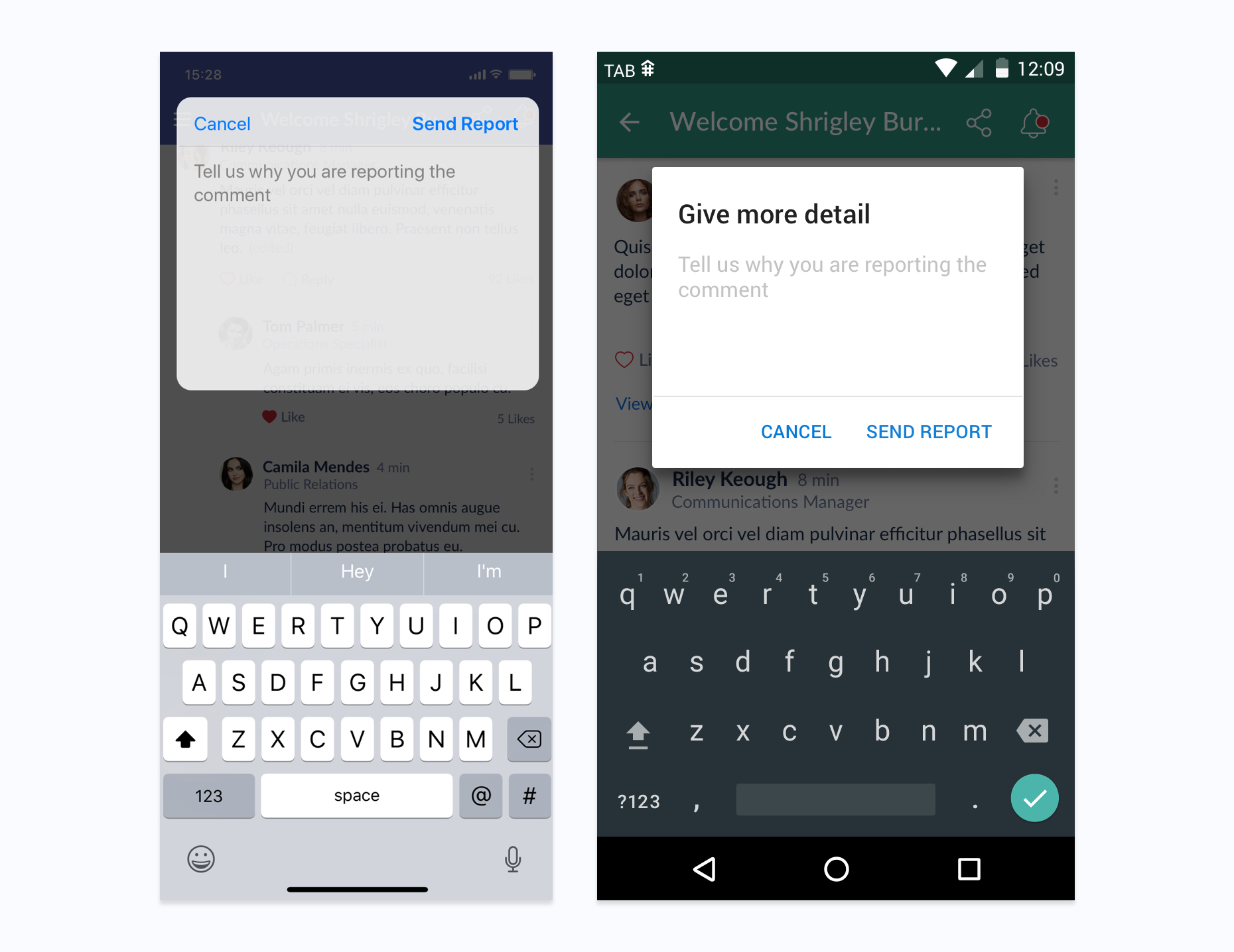
Alerts with inputs in both iOS and Android