Forms
Forms are used throughout the iOS and Android as they allow users to be onboarded, update their profile and post content in User Generated Content lists.
The forms should be succinct and not require a lot of work to be carried about by the user. Processes that require users to provide a lot of information, such as onboarding, should be broken down into smaller steps, with only 1-3 inputs needed from the user on each screen.
Styling Forms
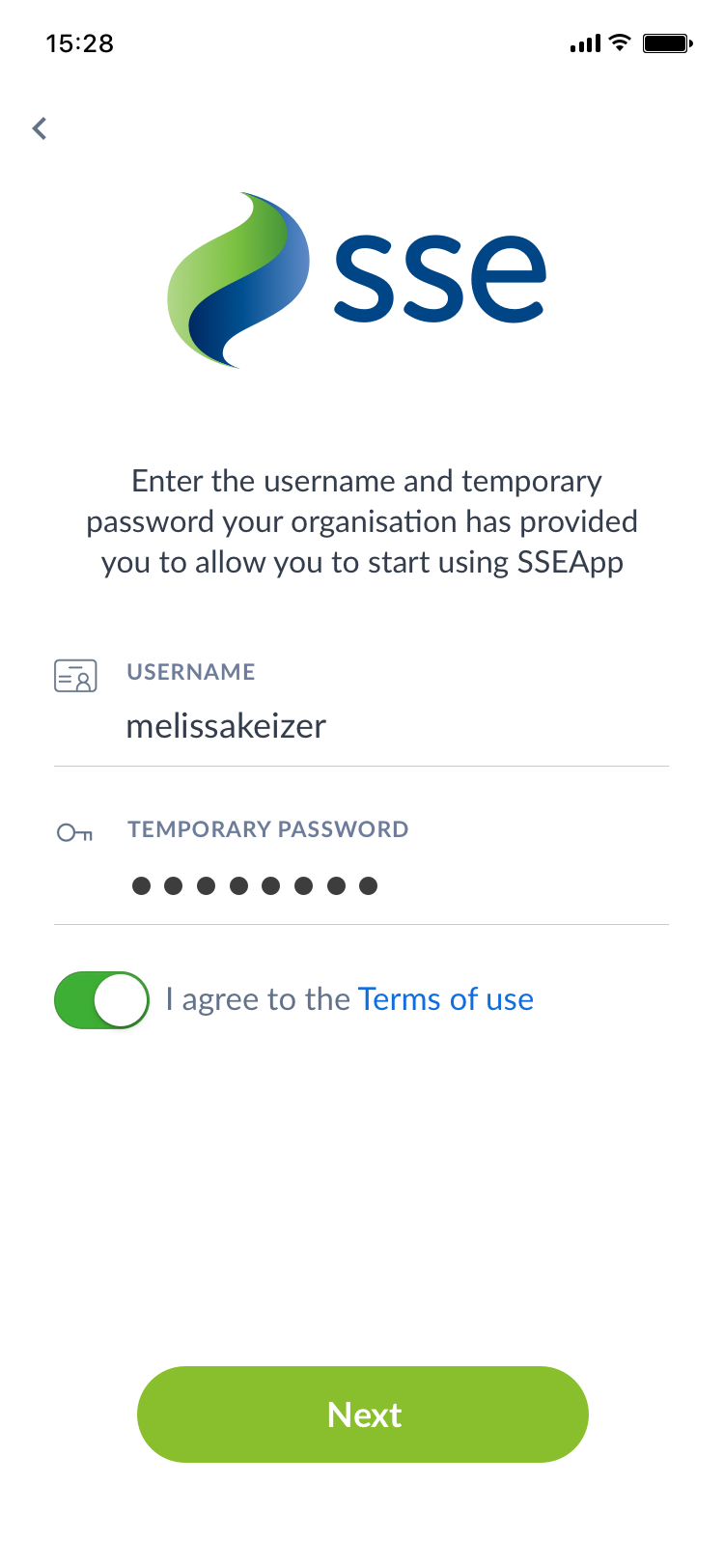
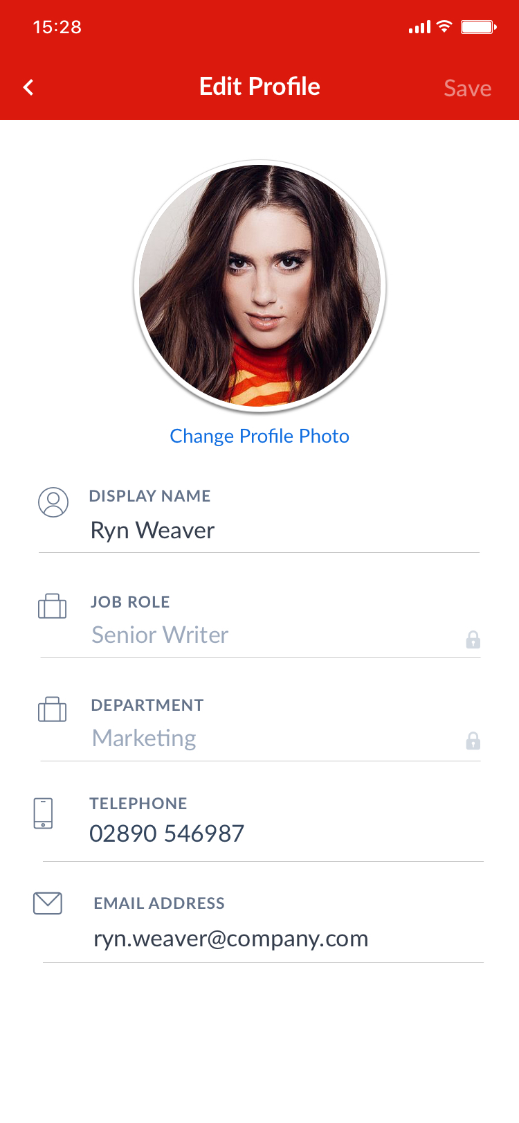
Most of the form fields used throughout the mobile apps are what we commonly refer to as "icon-escorted fields" as the the label and input are also accompanied by an icon to allow users to swiftly identify the field purpose.
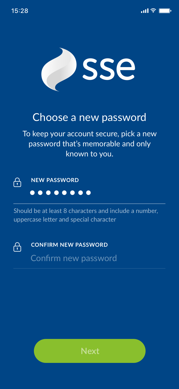
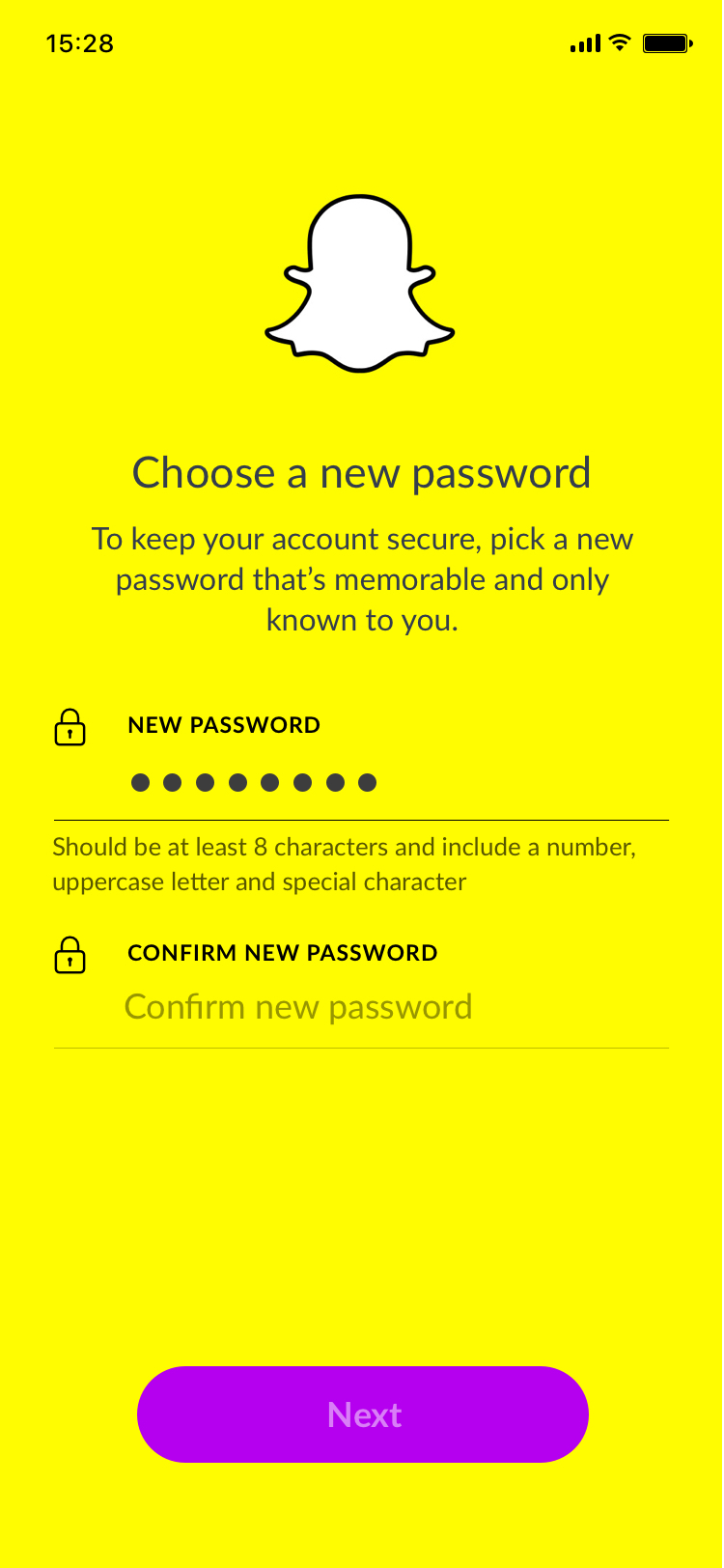
TheAppBuilder platform allows clients to brand their app in various ways, including the background colour and button colour of their login and registration screens. The text colours are then set dynamically using an algorithm that determines whether to use dark or light text, depending on the background colour.
Default Theme
While the app can be themed by the client in the CMS, a default theme should be applied initially. This "default theme" is also present once the user is logged into the app, as the brand colours are only displayed in the title bar and buttons and the background colour remainds white.
For default themed forms the icon and label should be SecondaryBodyColour in colour, the placeholder text should be PlaceholderColour and input text should be PrimaryBodyColour.
- Label: SecondaryBodyColour
- Icon: SecondaryBodyColour
- User Input: PrimaryBodyColour
- Placeholder: PlaceholderColour
- Bottom border (Default): BorderGrey
- Bottom border (Focus): LinkBlue
- Helper text: MetaTextColour


Onboarding screens showing the light theme (SSE) and dark theme (Snapchat)
Light Theme
When a client sets a brand colour for their app that is considered a dark colour requiring light text, the app will use the Light Theme. The colours for for each element are shown below.
- Label: White
- Icon: White
- User Input: White
- Placeholder: White, 40% Opacity
- Bottom border (Default): White, 25% Opacity
- Bottom border (Focus): White
- Helper text: White, 65% Opacity


Onboarding screens showing the light theme (SSE) and dark theme (Snapchat)
Dark Theme
When a client sets a brand colour for their app that is considered a light colour requiring dark text, the app will use the Light Theme. The colours for for each element are shown below.
- Label: Black
- Icon: Black
- User Input: Black
- Placeholder: Black, 40% Opacity
- Bottom border (Default): Black, 25% Opacity
- Bottom border (Focus): Black
- Helper text: Black, 65% Opacity
Note that button background colour can also be customised by the App Editor, but colour of the text is set by the algorithm and should be either black or white.