Widgets
Below are the content widgets used throughout the CMS when adding content to lists and modular pages.
List Content Widgets
Content widgets are added to lists by the app editor by choosing a content widget button. Each widget displays a featured image or a placeholder until a featured image has been choosen.
Social stats (if enabled) are shown underneath the audience link on the right hand side of a widget.
Placeholders, Missing Assets and Featured images
If the asset that is used for the featured image for a list item has been deleted from the media library, the missing asset placeholder should be used.
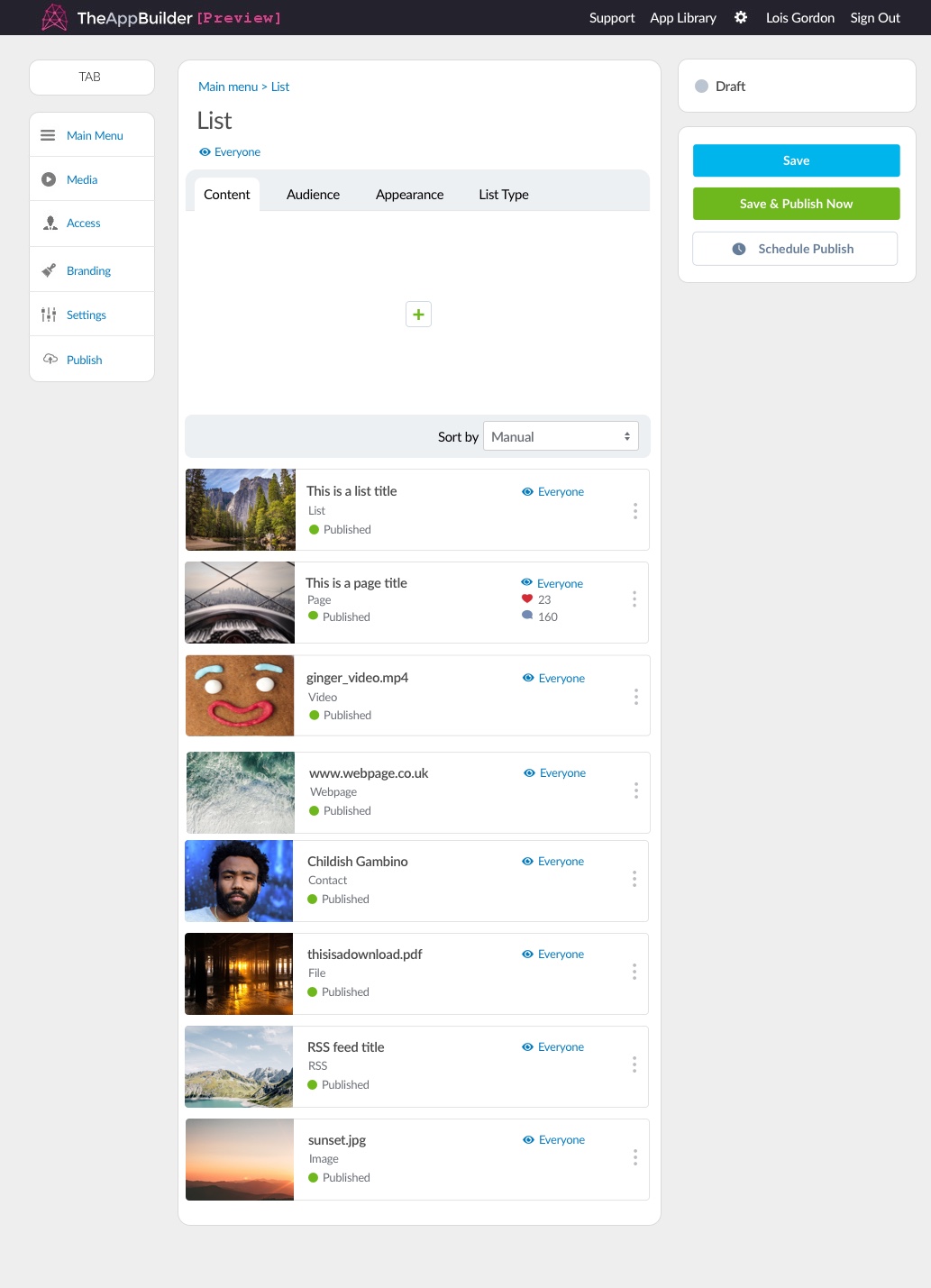
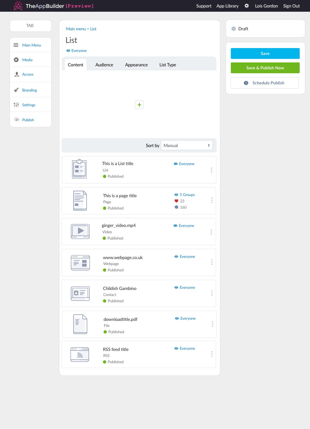
Examples of content widgets with featured images (left) Examples of content widget placeholders (right).
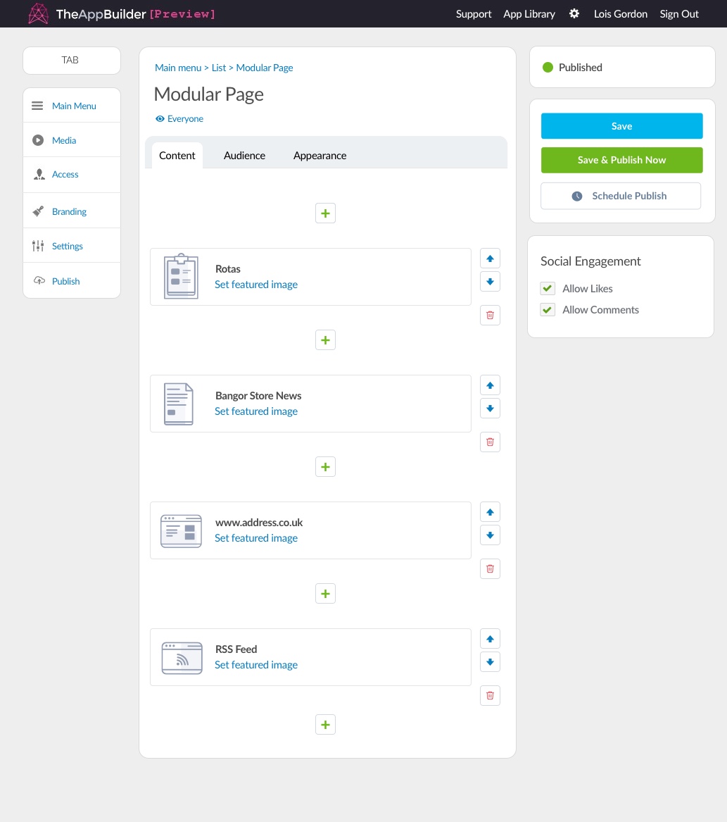
Examples of content widgets with placeholders on a modular page
If a video, image or file has been deleted from the media library but was once an item within a modular page, it will show the missing asset icon in it's place. Examples of how this is shown are below.
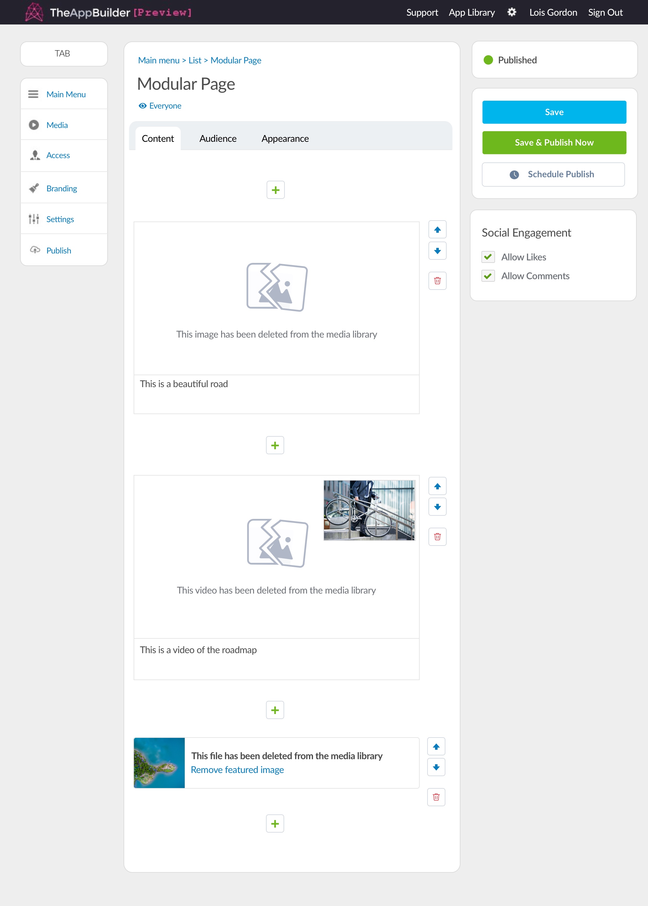
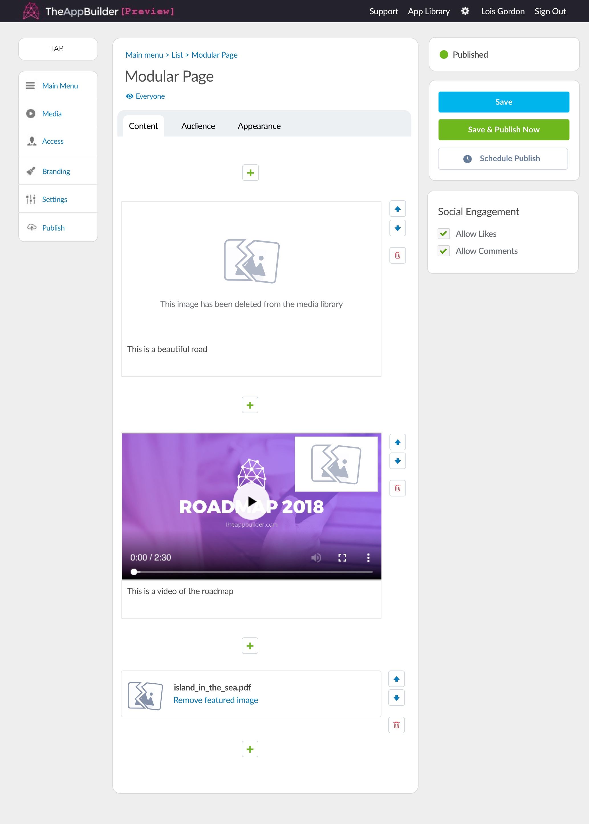
Content missing from an image and video widget but video still has featured image set (left) Image missing and featured images missing from all content (right).
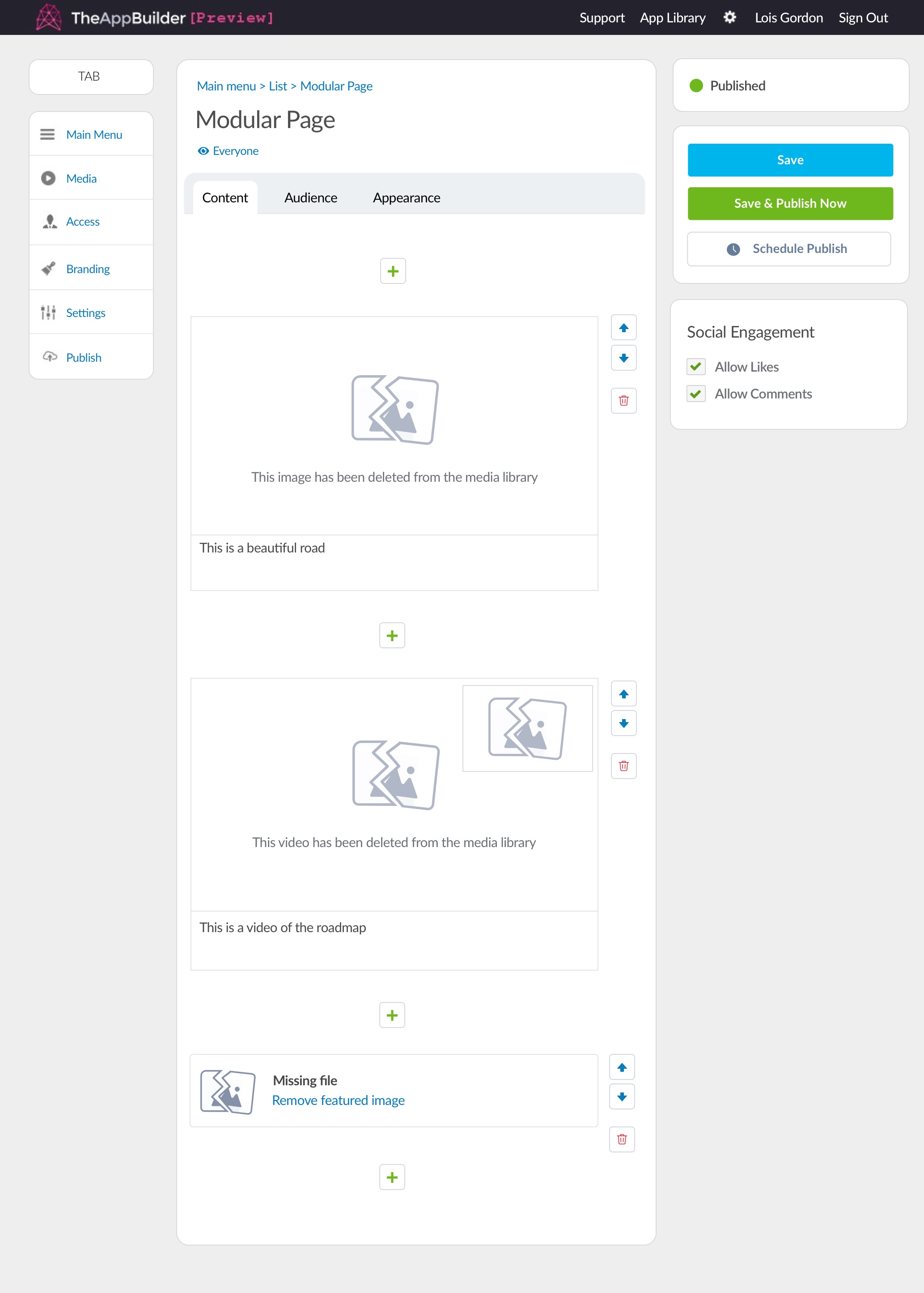
Example of everything missing, featured image and content. Note that when a file has been deleted from the media library the title changes to 'missing file'
Modular Page Content Widgets
Content widgets are added to pages by the app editor by choosing a content widget button. Each widget displays a featured image or a placeholder until a featured image has been choosen.
The widgets below are specific to a modular page section within the CMS. Modular page widgets have control buttons visible for simple organisation and rearranging. The content widget control buttons styling guides can be found on the CMS Buttons & links section.
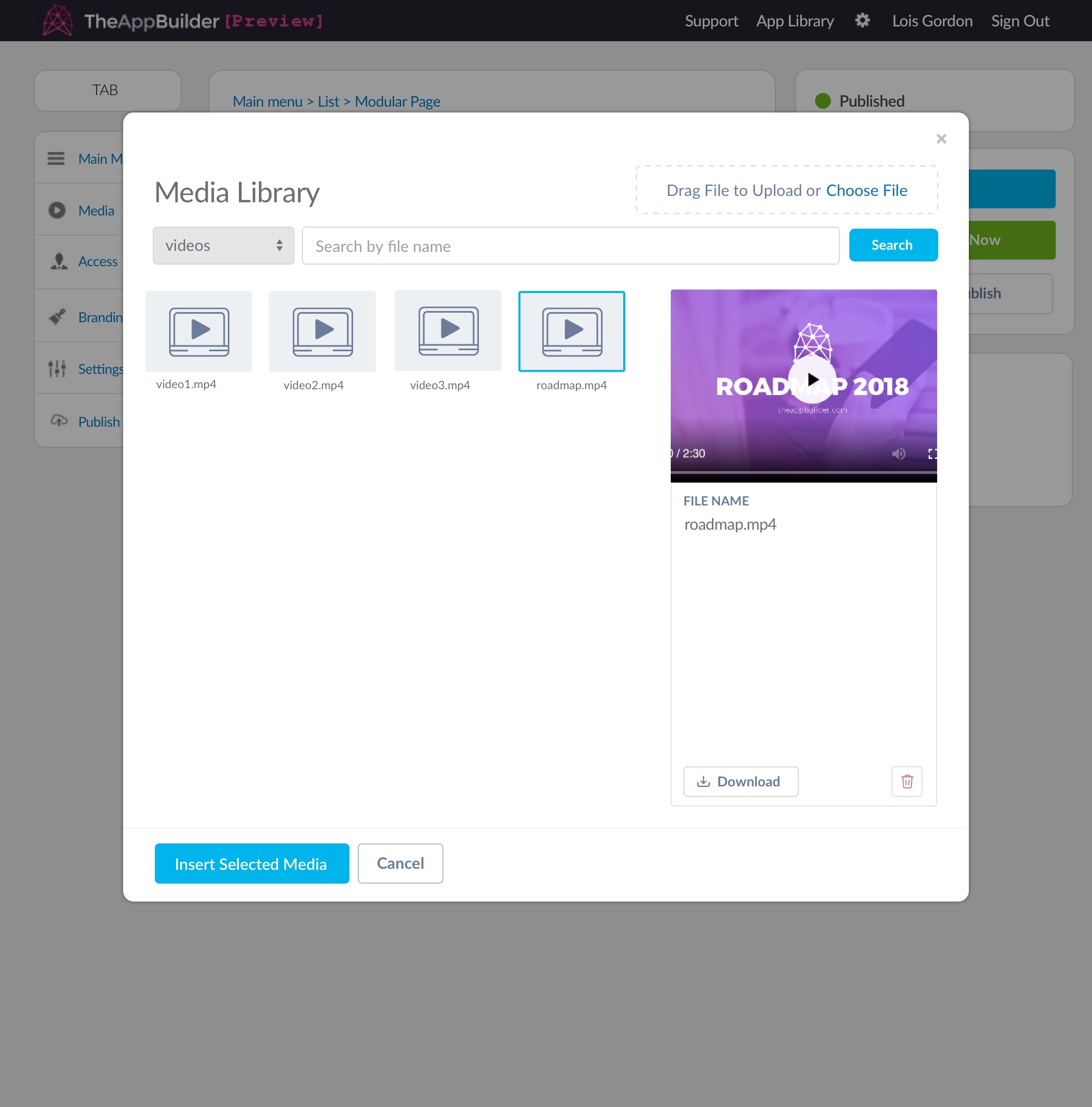
Video being added to a modular page - media library is automatically filtered to 'videos'
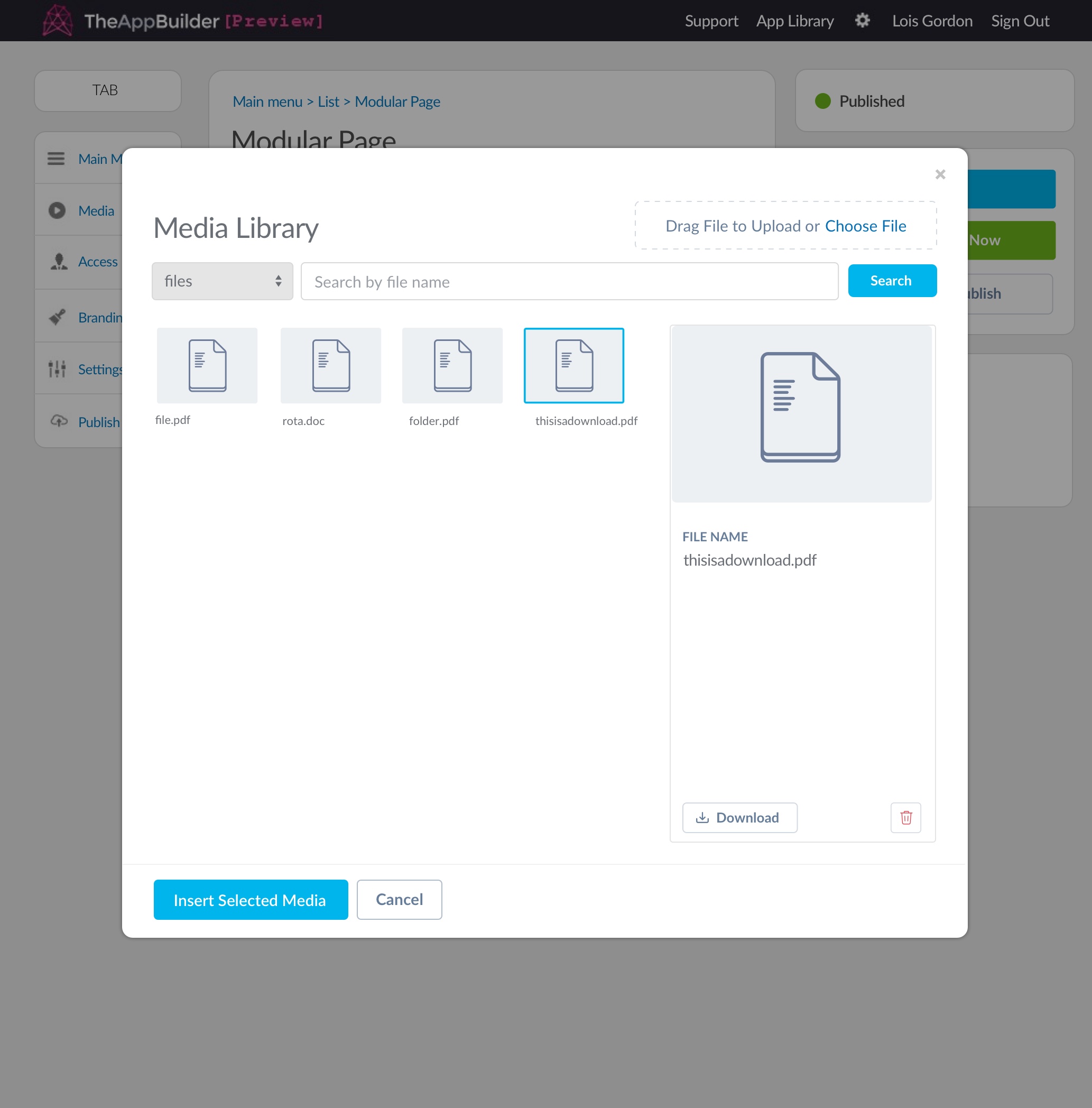
File being added to a modular page - media library is automatically filtered to 'files'
Existing Widgets
The existing content widget can have different types of content added. Below are examples of how the existing modal presents content.
If the asset that is used for the featured image for a list item has been deleted from the media library, the missing asset placeholder should be used. Before a featured image is added, the widget will show a 'add featured image' link which will open the media library when clicked. If a featured image has been added, the remove featured image link will show and put the content widget back to its original state.
For more detail on CMS content widgets, you will find designs here: CMS UI Design


