Styling a Tooltip
Tooltips are added in areas of the CMS that have FAQ's. They are carefully considered and only used when absolutely necessary. Examples where they could be are; when a control or button does not have a text label to support it, if a control benefits from a small description or further information or if a feature is rarely used or a feature that can be interpreted differently.
Designs can be found in the Abstract collection linked right here!
Tooltips with a link
These tooltips provide a brief explanation of what the item is and an external link to the appropriate area of the docs site. When a user clicks on the light grey question mark, the tooltip will appear. The tooltip will disappear after 2 seconds of no interaction (including hovering on it) or if anywhere else in the UI is clicked.
Overall styling for the tooltips are:
- Background: #6A6F75
- Micro Text Style
- Text Colour: #FFFFFF

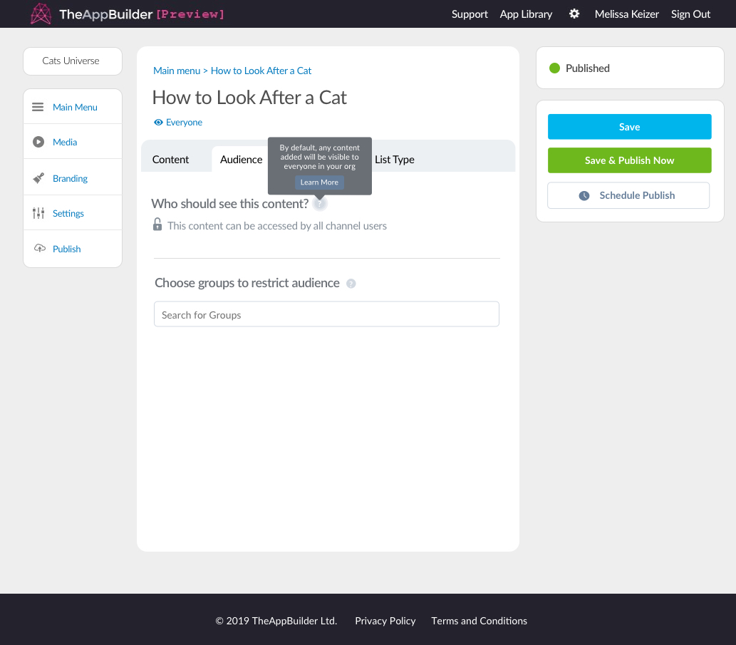
Tooltip on the audience tab with external link to docs site
When the tooltip has been clicked and is showing the grey circle that contains the question mark should pulse slowly until the tooltip is dismissed/disappears.

Tooltip with link to docs site and pulsing question mark
Styling for the tooltip follows styles that are used throughout the CMS currently. The only unique part is the external link/learn more button. Button & Tooltip colours can be found in CMS Colours.
The maximum height for this tooltip is 70px and the maximum width for this tooltip is 190px. The width should never change but the height of the tooltip is determined by the paragraph of text. The text should never be more than 3 lines. The learn more button should be centre aligned.
The pulsing question mark colour is: #FFFFFF and the background is #EDF0F3 which is used for shading in illustration in the CMS.
Button not to scale. Button background is $buttonSecondaryText (#6D7C98) and the tooltip itself is $cmsGrey (#6A6F75).
Tooltips without a link
These tooltips provide a brief explanation of what the item is and doesn't require an external link button however, the styling is the same aside from this.

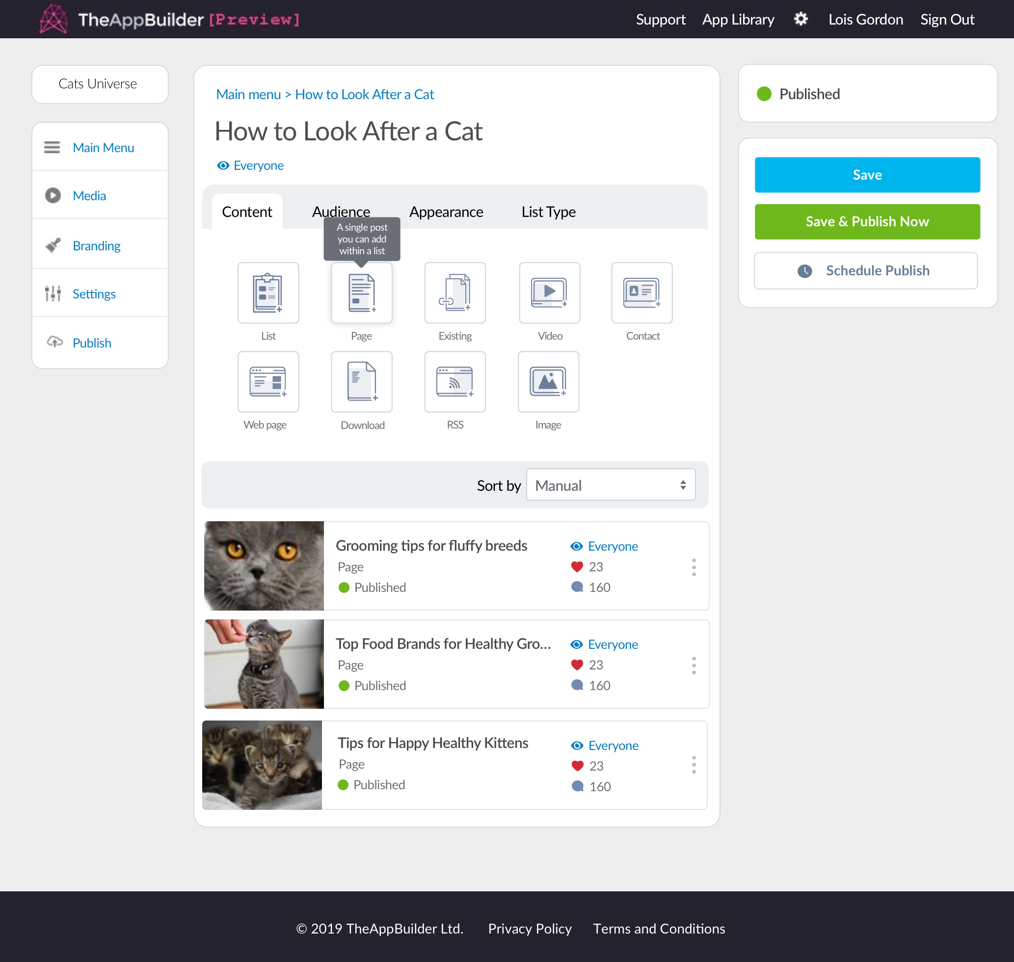
Tooltip on a content widget button without an external link
The behaviour of these tooltips are different as they appear on a button. These content widget buttons have a hover state and active state, so the behaviour of the tooltip has to consider this.

Tooltip that would appear on a content widget button
Upon hover, the content widget button instantly shows a shadow, when the button has been hovered on for 1.5 seconds then the tooltips should appear. When the user's cursor is moved off the button the tooltip should disappear.