Tables
Tables are used to display data about users, user groups and channels. The number of columns shown on a table varies depending on the table content.
| Username ▲ | First Name | Last Name | Job Role | |
|---|---|---|---|---|
| john.morisson@theappbuilder.com | John | Morisson | IT Manager |

|
| peter.graham@theappbuilder.com | Peter | Graham | Global Director |

|
| alison.beattie@theappbuilder.com | Alison | Beattie | Public Relations |

|
| mark.mccaigue@theappbuilder.com | Mark | McCaigue | HR Manager |

|
| jake.curry@theappbuilder.com | Jake | Curry | Managing Director |

|
| melissa.keizer@theappbuilder.com | Melissa | Keizer | Design Lead |

|
Table Data
The unique name or ID of the data should be the data in the first column of any table, so for example a user’s username would be at the start of the row. This should also be a link to the user/user group/channel detail page, note that it should also be styled as a link.
The table data should be left-aligned. There should be a small amount of padding on the very first column and very last column so the data is close to the edges of the table, but not touching it. The columns between the first and last columns should use equal spacing between them and the table should feel balanced visually.
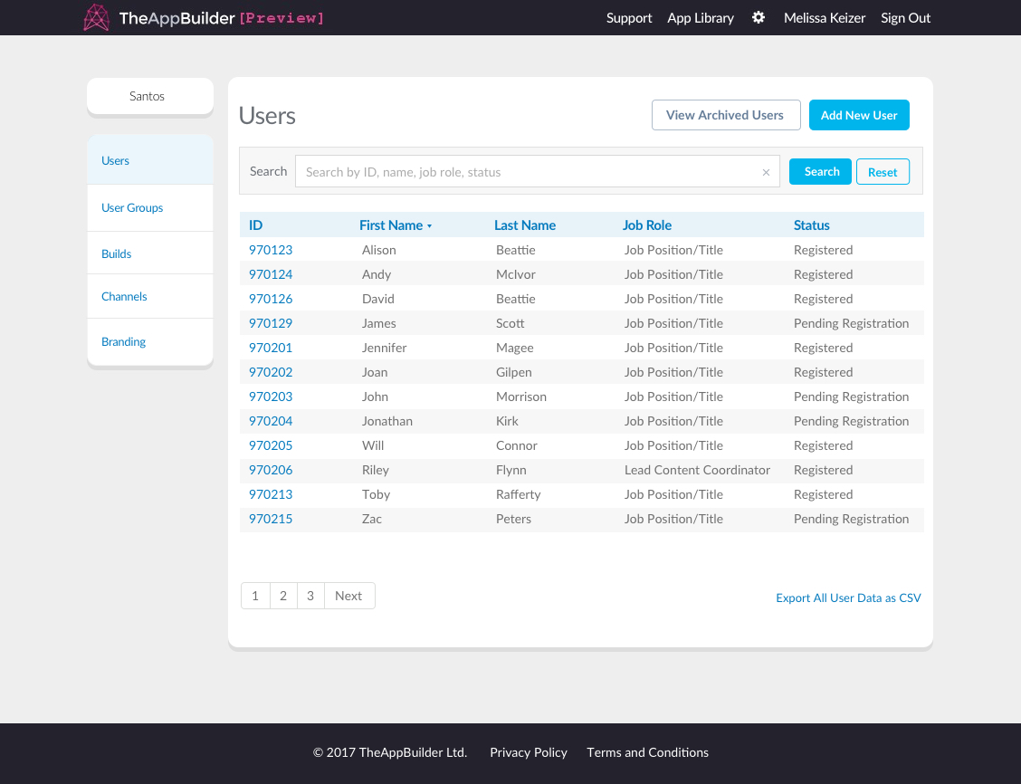
Users listed on a table
There are however a few exceptions this. For example, in the table showing User Groups for a Channel, there are only 2 columns of data. The first is aligned to the left, however the second column of data is right-aligned, and a remove icon is shown on each row. This approach is used when there are only 2-3 columns of data for the table.
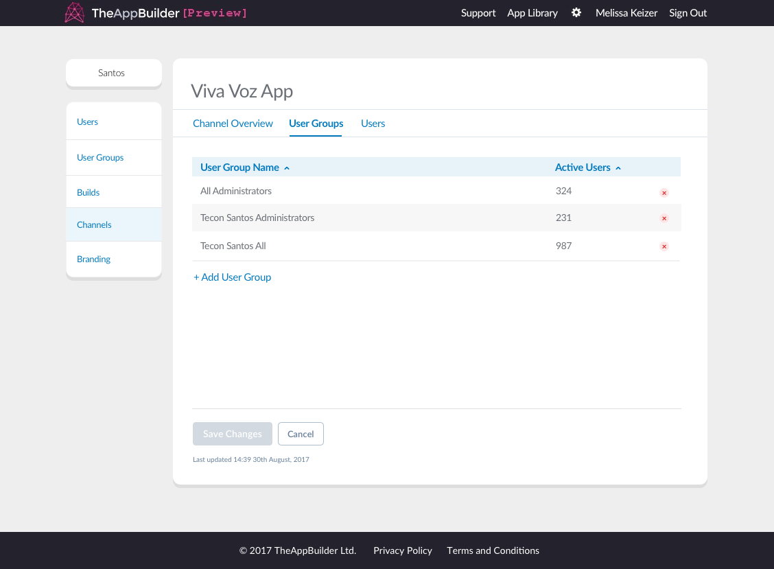
User groups on a channel table
Pagination
Tables should limit the rows of data to 20 rows total, with the rest of the data accessed by using the pagination buttons below the table on the left side. If there are less than 21 rows of data the pagination should not be shown.
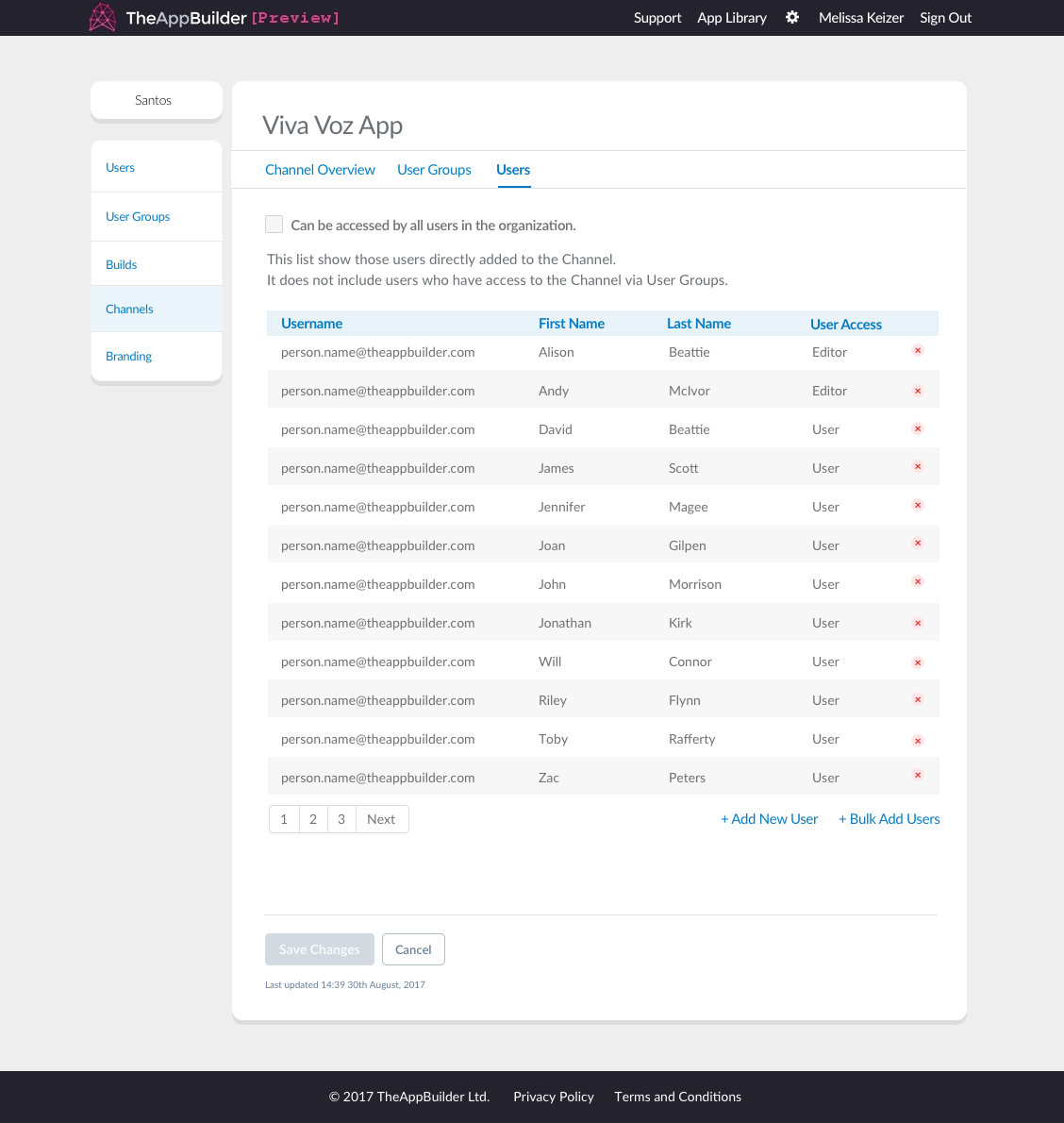
Pagination will appear under tables with more than 20 rows of data
Tabular data shown inside modal windows should behave differently. There should be no pagination but instead load more rows of data as the user scrolls down the table within the modal window. Note that the modal does not change size, the table should use overflow: hidden; to keep the extra rows contained.
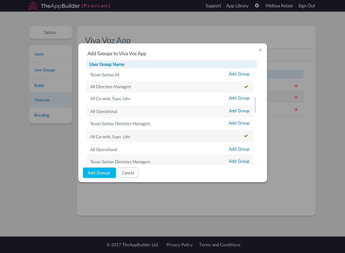
Table shown inside a modal
Table Actions
A user may be presented with a link to perform a specific action related to a table, for example, adding new users to a channel. This link will be left aligned underneath the table if there is no pagination, however links should be right-aligned underneath the table if pagination is present.
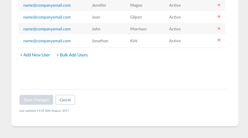
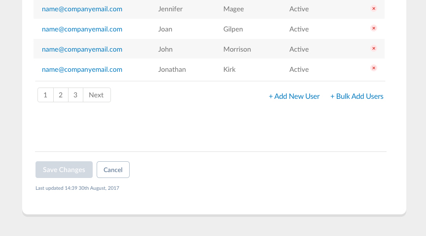
Table actions are usually presented on the left side under the table, unless pagination is present
Table Search
On the overview page for Users, User Groups and Channels, the table shown on the page will have a search box above it, allowing the org admin to filter the table based off their search criteria. Once they type something into the search text input they must click “Search” or hit enter on their keyboard to show the filtered table results. By clicking on “Reset” the input is cleared and they are shown the full table again.
As the user types into the search box a dropdown with suggestions should appear. Users can clear the text they typed by clicking on the “x” at the end of the search box or the Reset button.
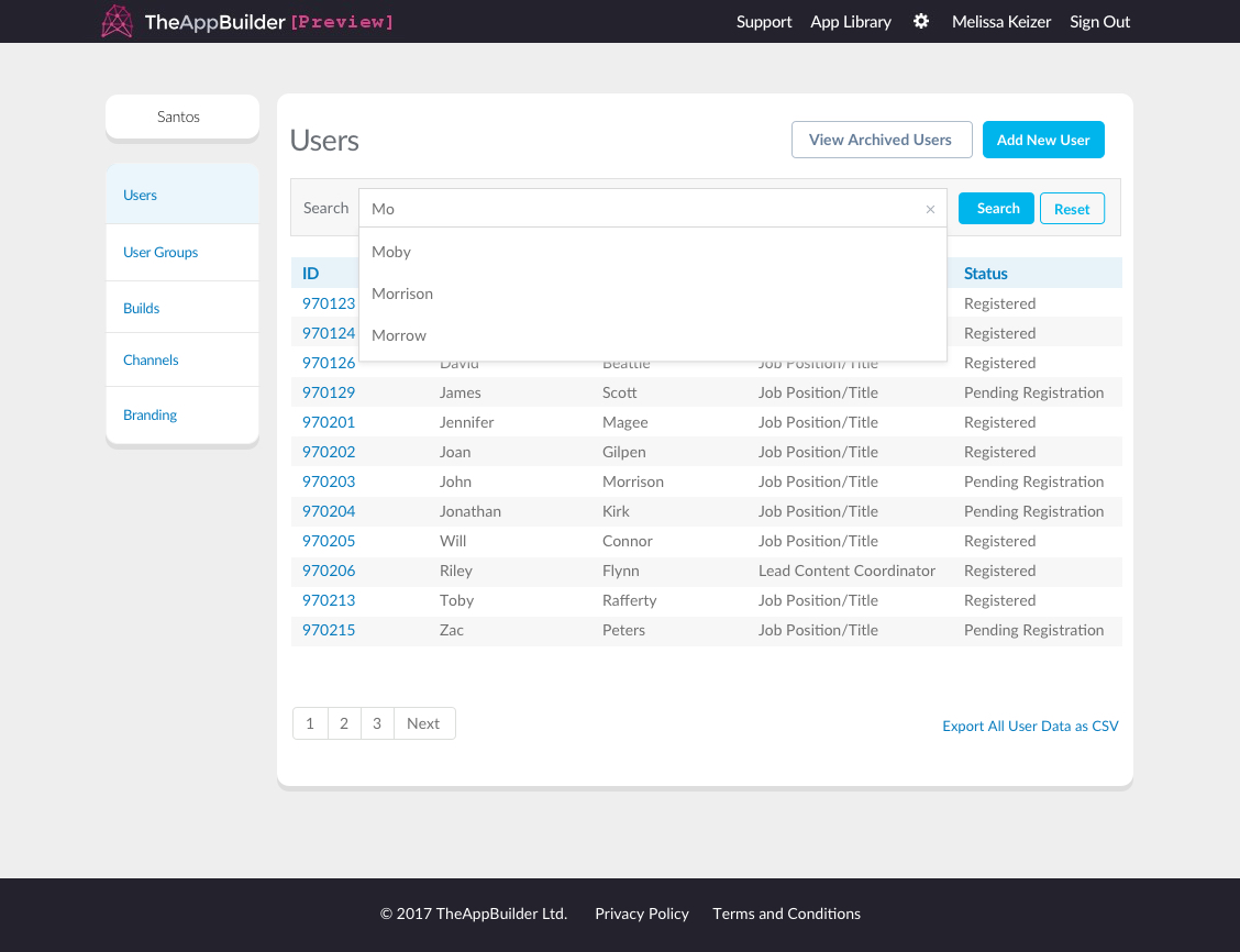
Searching for users in a table
Styling a Table
The table head should always be light blue (#E7F2F9) with blue (#067BBE) coloured text. Tables should be candy-striped, with every odd numbered row being white and every even numbered row being grey (#F7F7F7).
The table data should be Lato regular, size 14px. In most cases the text should be left-aligned and inline vertically with the table heading.