Styling a Page
The majority of the CMS is made up of pages that follow the same format. The pages consist of a page title at the top, navigation along the top, the main content area usually containing forms or actions for the user, then the “save changes” and cancel button at the bottom.
Page Navigation
When a user clicks on the name of a user, user group, or channel they will be brought to the overview page for that section. This is the first “tab” on the page. The title for the whole page section is shown above the page navigation.
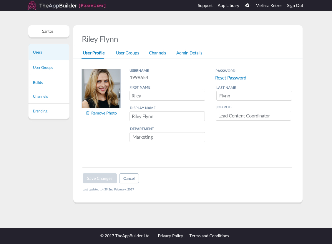
The overview page for a user
Note that while the navigation is styled to look like tabbed content, it does not behave like tabs usually do. Each page has it’s own URL and if content on the page is changed, it must be saved before clicking on another “tab” or link or else changes will be lost.
The only place where this behaviour differs is on the app content screens where an App Editor can publish changes to their apps. Here the tabs act like the usual javascript tabs, allowing the users to jump between sections without having to save each time to avoid losing their changes. These are styled differently to indicate this difference in behaviour.
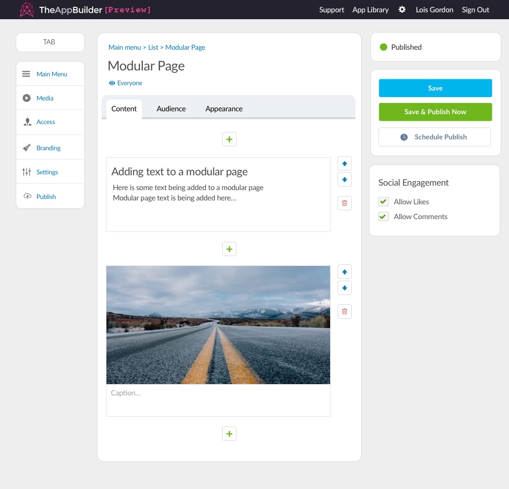
App editor pages use different tab functionality from org pages
Page Content
The white panel on each page should be given a minimum height of 600px. This provides a better experience of moving between each panel as it won’t give the look of jumping about as the user moves between screens since even the pages with very little content will show a panel that is 600px tall.
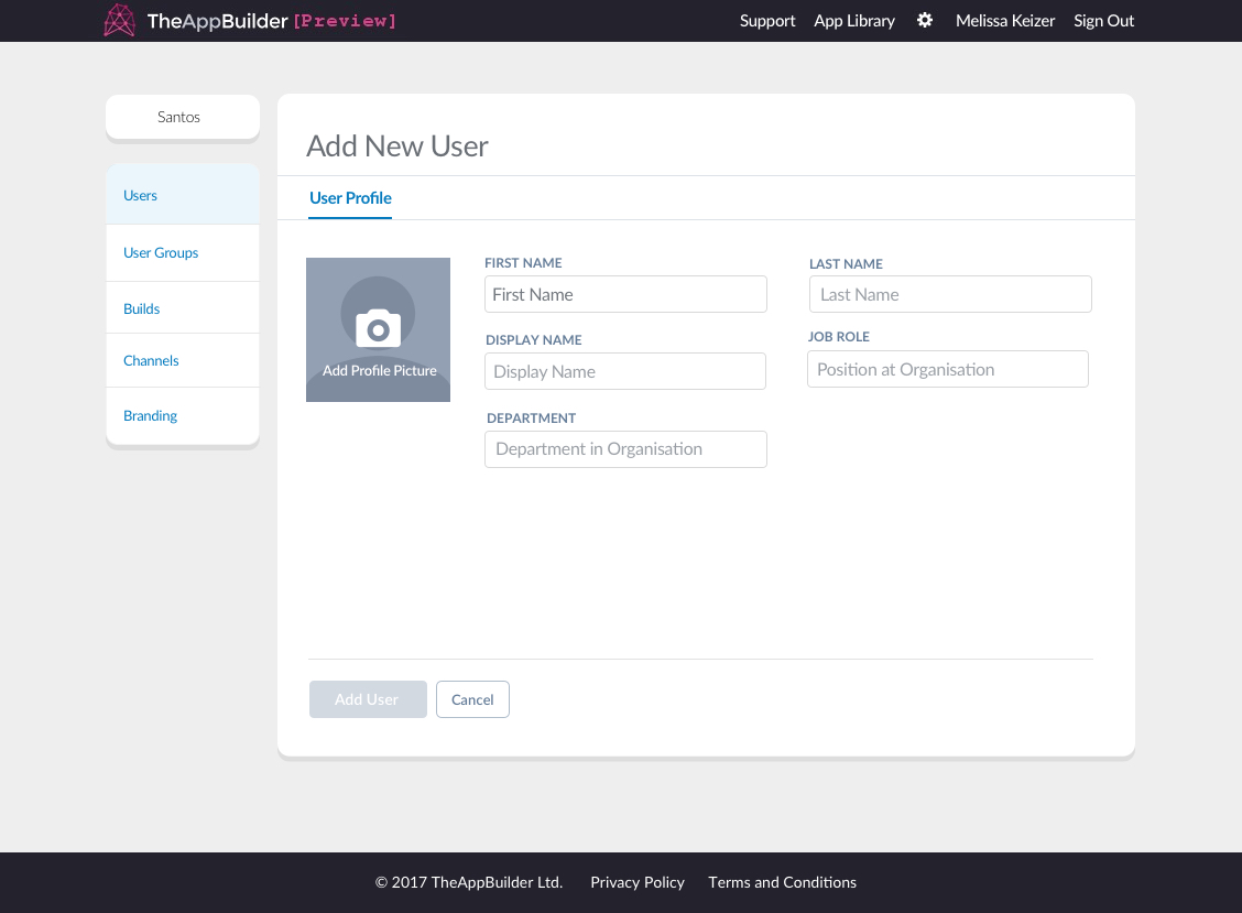
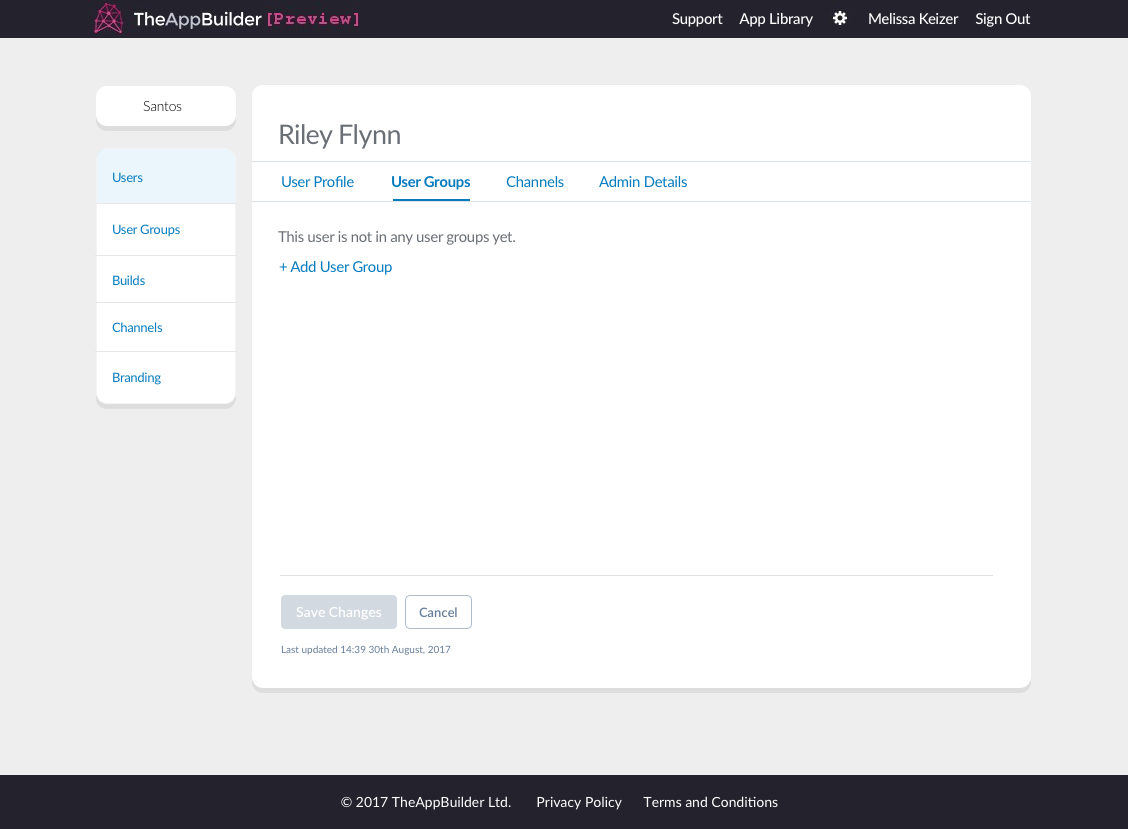
The white panels on Org Admin pages have a minimum height set
Empty States
When there is no data to show on the Users, User Groups or Channels section the page will show the empty state which consists of a short message and call to action link.
For example, if a user has not yet been added to any user groups, the org admin will see the message “This user is not in any user groups yet.” Below this will be a link “+ Add User Group” which will allow the org admin to select User Groups for the user to be part of as it opens a modal with the list of User Groups.

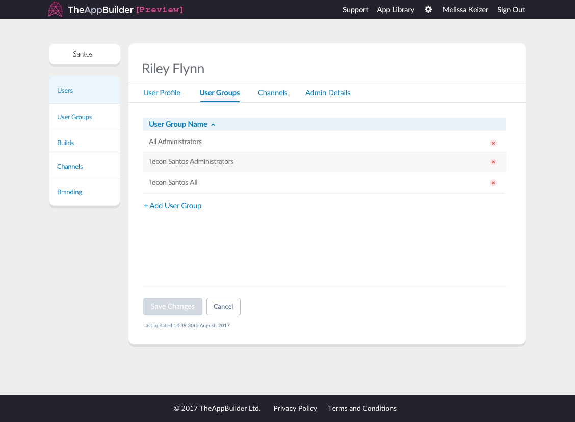
Views for when a user has no user groups then when they've been added to user groups
Once one or more user groups are selected and confirmed, it will be listed on that page as tabular data. The message “This user is not in any user groups yet.” will no longer appear on that page. The link “+ Add User Group” will now appear under the table. User groups can be deleted from the panel by clicking on the delete button at the end of the row in the table.
Saving Changes
At the bottom of each page there are two buttons under a horizontal rule. A “Save Changes” one and a “Cancel” button.
If a user updates data on a page the Save Changes button will change from its grey, disabled to blue indicating changes have been made and they can save these changes. If the user navigates away from the page without clicking this button the changes they made will be lost. The user can also undo their changes by clicking on “Cancel” if they have not yet saved their changes.
Below these two buttons is a line of text that displays the time and date of the last saved update to that section. This uses the micro text styling shown in the Typography chapter. This button section should be positioned at the bottom of the page, regardless of the amount of content above it.

Save changes and Cancel buttons with the last updated line of text beneath