Modals
Modals are used in the CMS in a few use cases, including but not limited to;
- Selecting users to be added to the audience of a piece of content
- Adding watchers to a piece of content
- Selecting users groups for a channel or user to have access to
- Selecting users to add to a channel or user group
- Bulk adding users to a user group or channel
Standard & Mini Modal
There are 2 sizes of modals used, the standard modal and mini modal. The main difference between them is their size.
Add Groups to App
Bulk add users to user group
- 150 total users
- 100 users already in user group
- + 40 new users added to group
- ! 10 users unrecognised and ignored - download log file
Standard modals are 617px by 455px tall, while the mini modals are 446px by 275px. If there is a lot of content to display it should be scrollable within the modal itself. The scrollable area is the main content area beneath the top title area and button area at the bottom. Both of these strips stay in place while the user scrolls the content behind. This ensures the context of the modal is always clear (as the title can be seen) and the action buttons are always in view.
Both use the h2 styling on their titles, use the standard “x” close icon, a grey border under this top section, and buttons placed on the left side at the bottom of the modal. When onscreen a full-screen black overlay with 37% opacity should be placed behind the modal.
Buttons on Modals
There should be a primary button (for the core modal action) and secondary button (to cancel the action and close the modal) present. Note that a lone “close” button should never be displayed, users should instead use the “x” icon in the top right corner to close the modal if no cancel button is shown.
Delete Modal
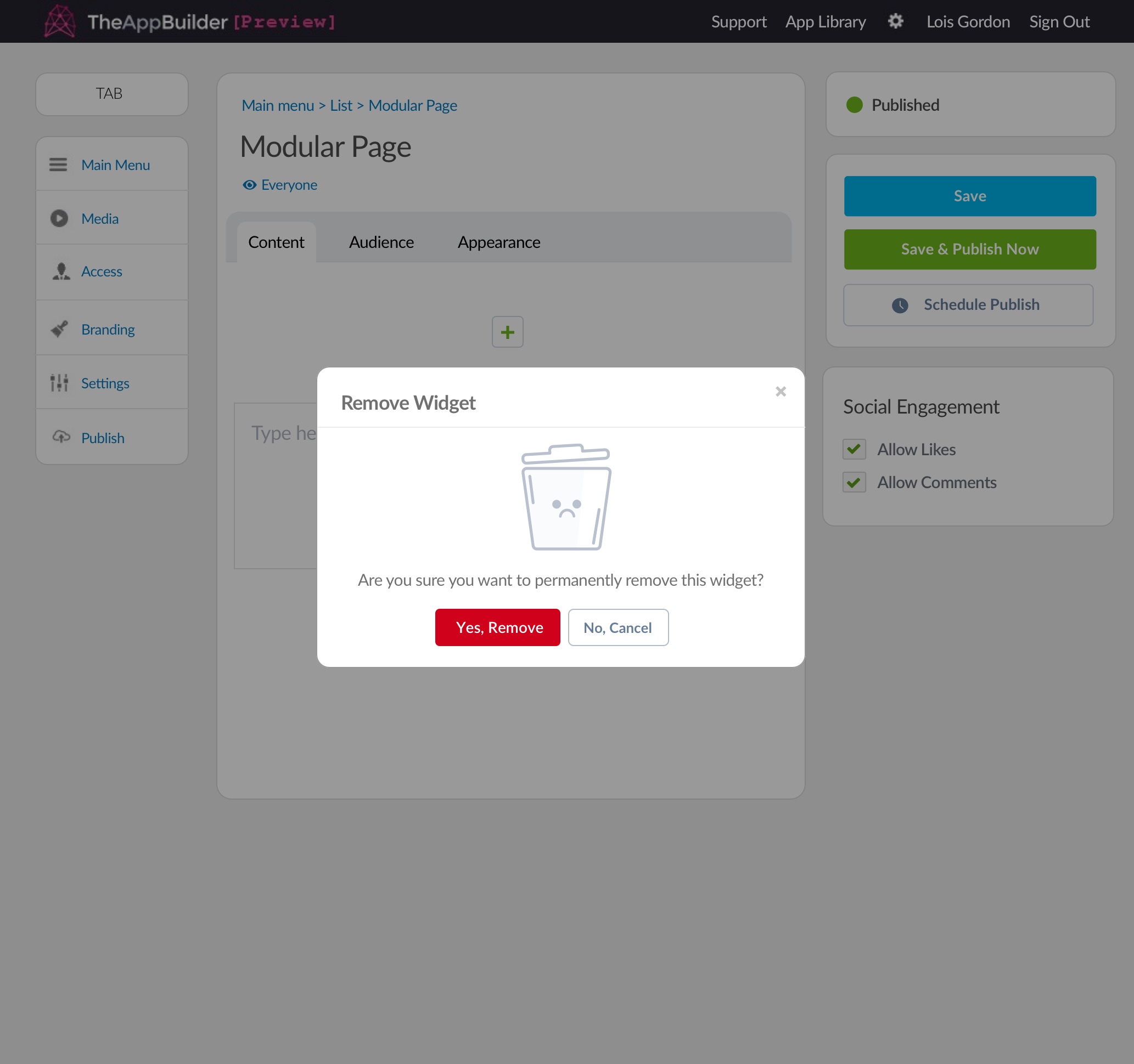
When an app editor clicks the delete or remove button on the CMS, they are presented with a modal to confirm deletion. It features an illustration and two primary buttons; one to confirm deletion and the other to cancel/close the modal.
The delete modal is used throughout any instance in the CMS where delete or remove is an option.

Delete modal on a modular page.
Progressive Modal
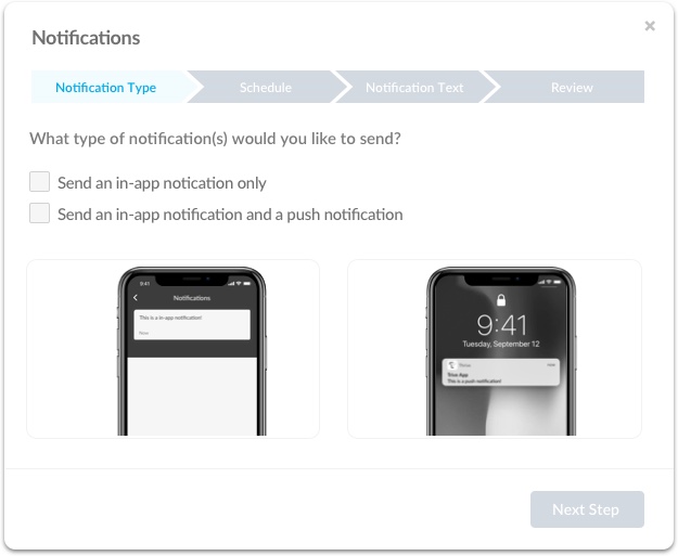
Progressive modals are 617px by 505px tall, slightly taller than our normal modals as they are only used for specific circumstances.
The first step on all progrssive modals has the first tab in its hightlighted phase, background-colour: $buttonPrimary at 5% opacity with the text colour: $buttonPrimary. While the unfinished/additional tabs will be disabled.
Slight footer change as well on the progessive modal. The 'Next Step' button is always bottom right to promote a natural flow when being guideed through the modal.

First Stage
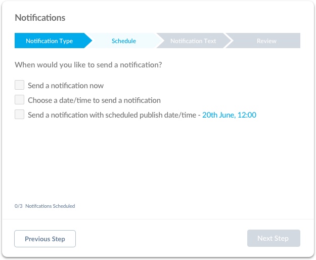
When the user has progressed through the modal and completed previous steps, the previous tabs when are completed change to a 'complete' state. The background-colour: $buttonPrimary with the text colour: white
An additional button also appears in the footer, 'previous step', logically at the bottom left as the user will be going to the previous stage if selected.

Middle Stage
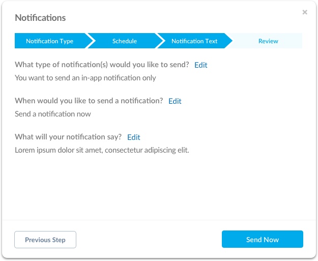
When the user is on the last tab, the bottom right button text would be custom to action which will be happen once clicked, in this case 'send now' as the user is sending a notification.
Note: tabs are clickable and will take the user back to the selected tab once selected.

Last Stage
