Errors & Warnings
The placement of error messages or warnings is dependant on the context. For example, in some cases a warning will show at the top of a page, however error messages often appear directly underneath an input field.
Text input or text area errors
Generally error messages will appear directly under a text input and the border of the input will also be red to highlight the error. No warning icon is shown.
This is not a valid display name
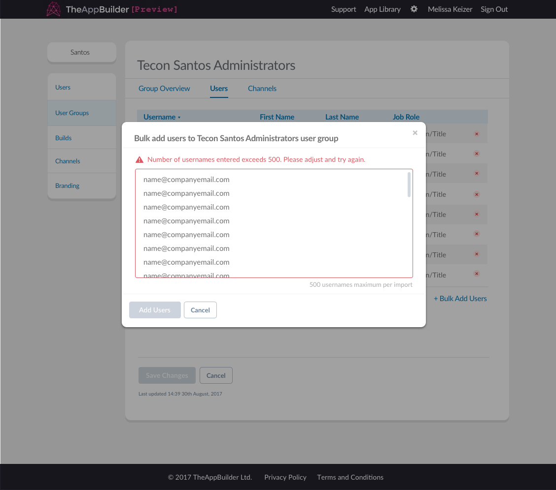
However there are times when errors or warnings are shown above the field. For example if the field or textarea in the only data input on the page or on the modal, the warning will appear above it with the warning icon appended to the beginning of the text.

Error message showing above field in modal
Page warning
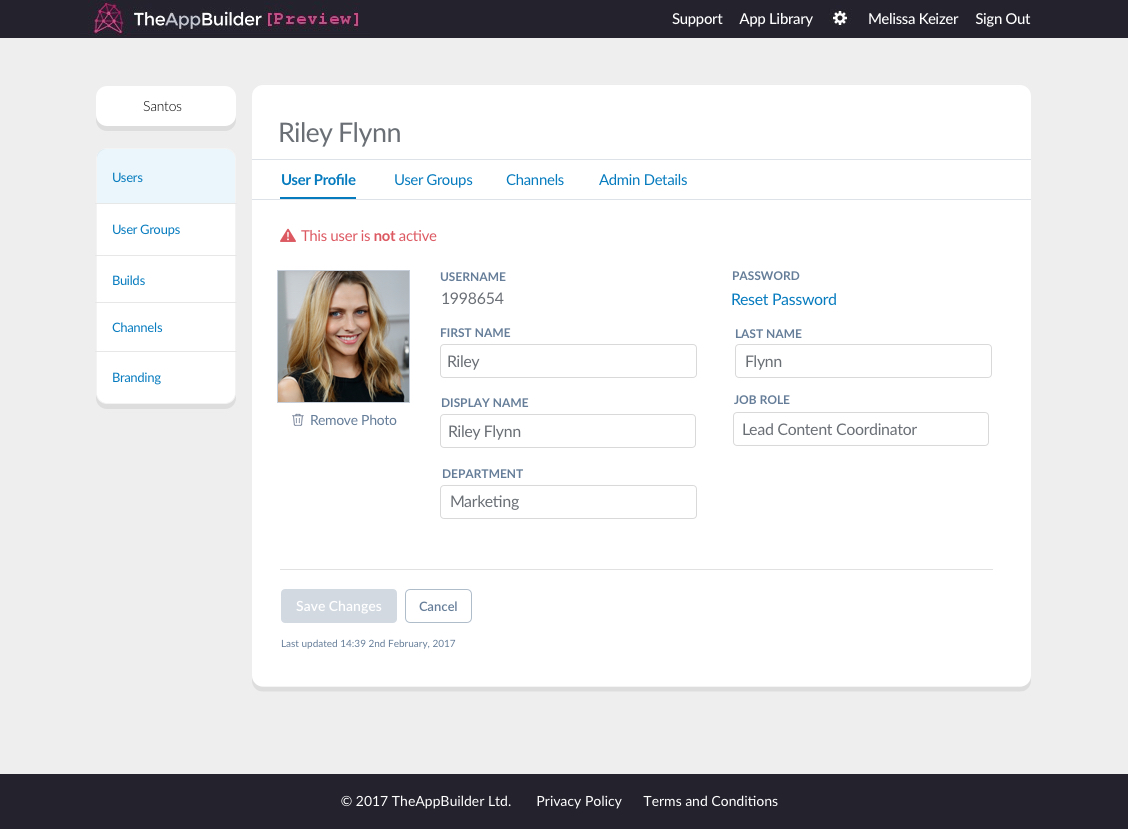
If a warning relates to an entire section, for example, when an admin can changes the user groups a user belongs to but the user is not currently active, this shows as a page warning. A warning message will show at the top of the page content and will be red with a red warning icon appended to the beginning of the text.

A issue affecting the whole section is indicated by a warning message shown at the top of the page
Banner Error's
Coming soon