Buttons & Links
Throughout the Org Admin screens in the content management system we the primary button to allow users to perform core actions such as saving changes to forms or adding users to user groups or channels.
Primary button
The primary button should only be used for positive, progressive actions. The primary button will appear grey (disabled state) until the user takes an action like updating the form on the page, then it will be blue to indicate changes have been made and that they are able to save them.
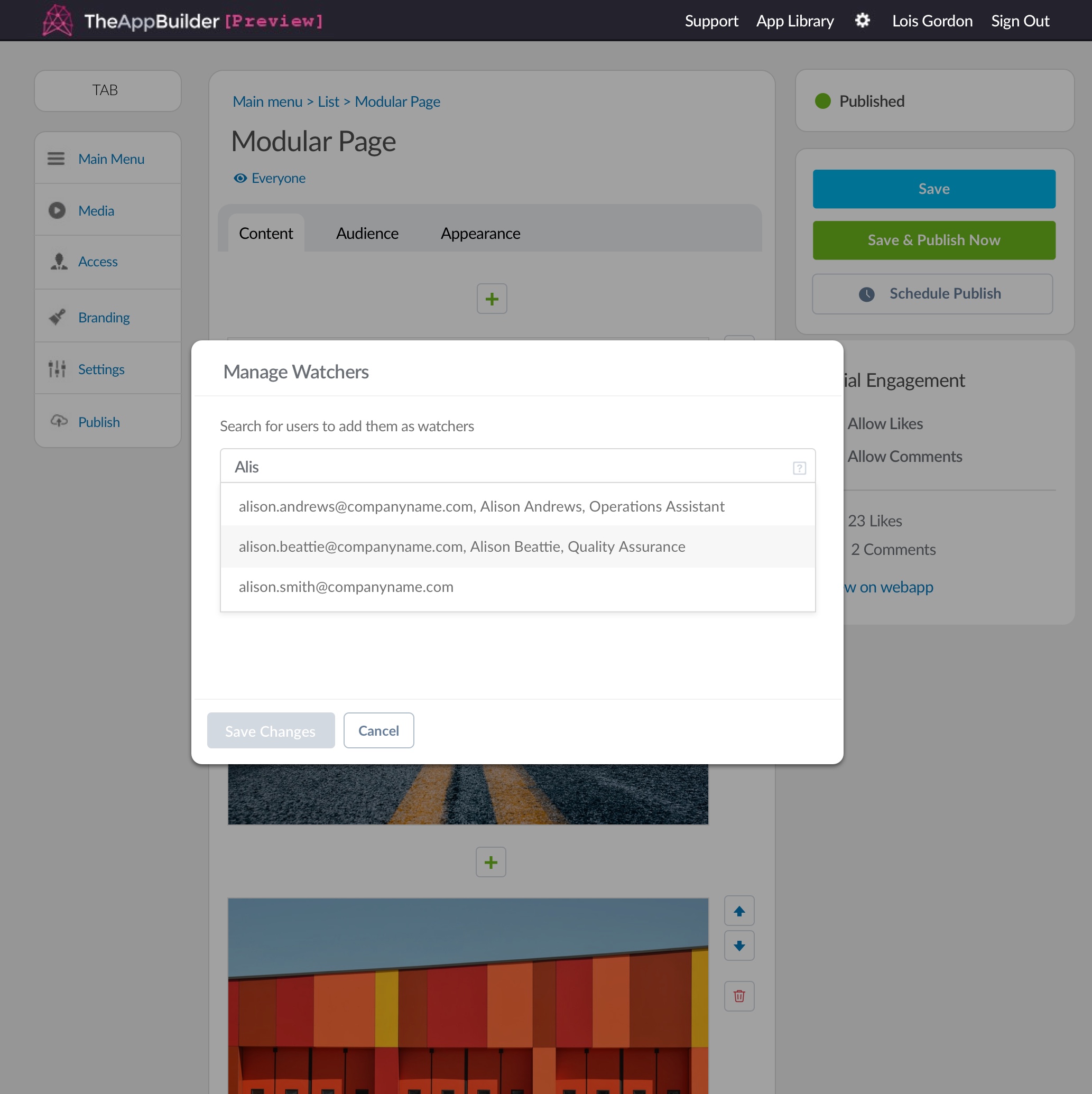
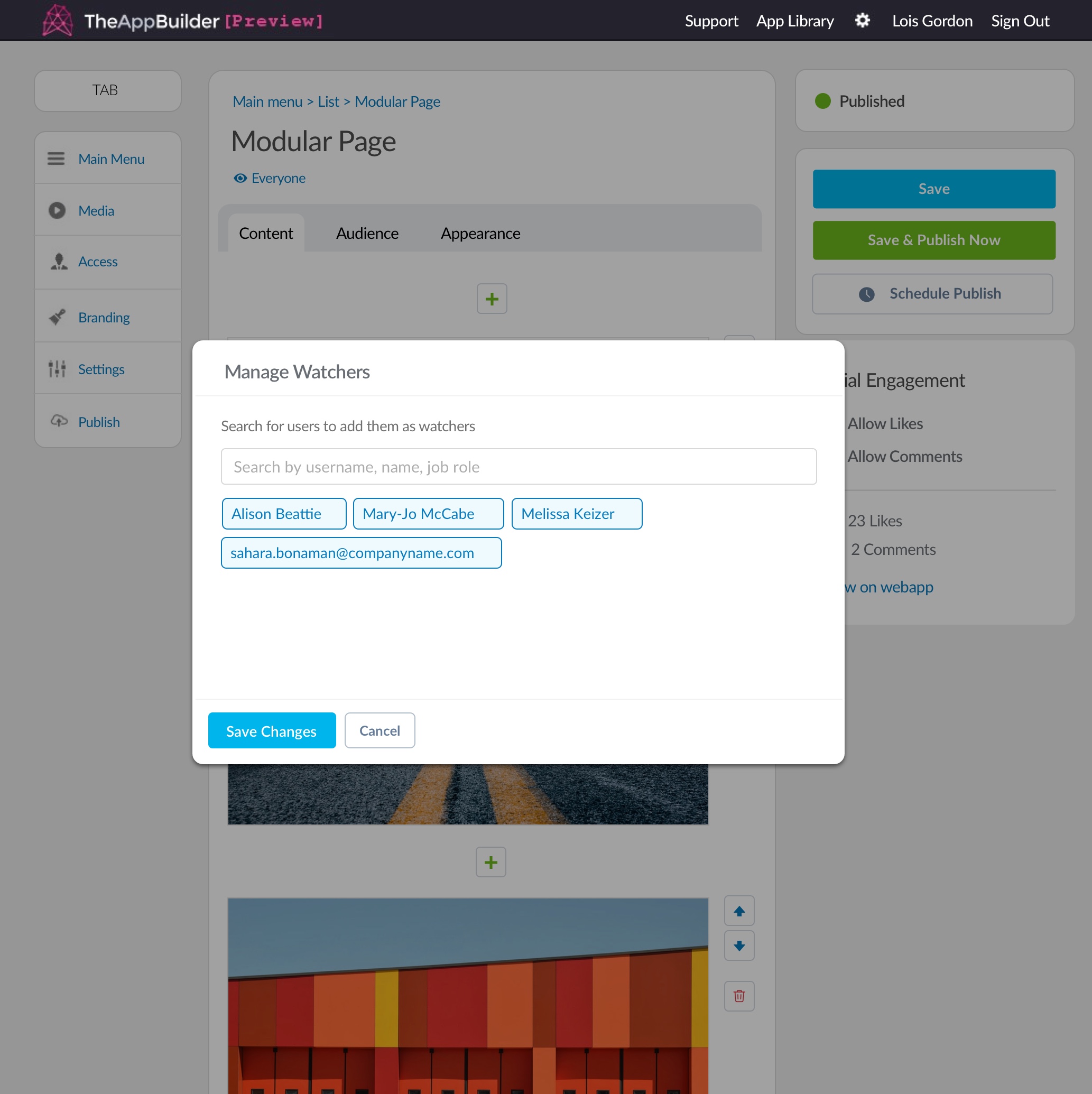
Buttons before and after a user has made changes to watchers
Secondary button
The primary button will be accompanied by a secondary button, most of the time this is a cancel button that allows them to discard their changes.
The button elements are shown below. Note that the background of the secondary button is transparent rather than white.
We also have mini versions of the primary and secondary buttons. These are used in the search bars above tables in the Org Admin screens.
Content Widget buttons
The content widget buttons are used by app editors to create lists and to build content within a modular page.
Below is an example of the hover and active state of content widget buttons.
Content widget button Labels should be styled as paragraph text. See CMS Typography for styling.
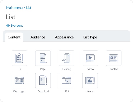
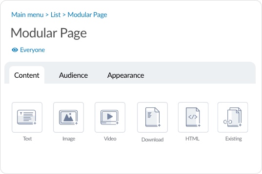
Examples of content widget buttons on a list (left) and a modular page (right).
Widget Control buttons
The widget control buttons are used to organise the order and delete content widgets a modular page.
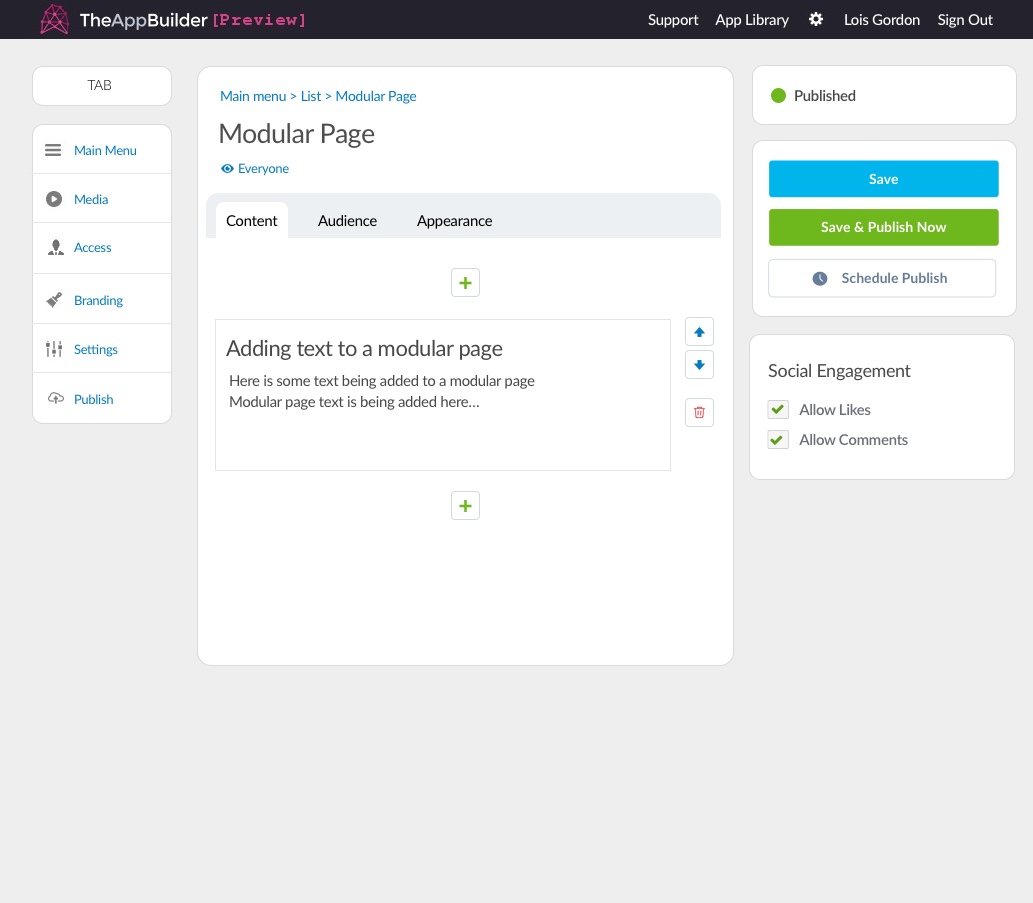
Examples of widget control buttons on a modular page. (See typography section)
Links
Links are used instead of buttons for many other actions a user can take on a screen. For example, adding new users to channels or user groups. These blue links will often had a “+” in front of the text to indicate the adding action.
Micro links are also used in the Editor section of the CMS to display the number of groups that can view content and link to the audience tab for that content.
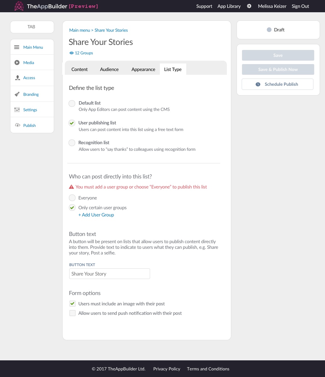
Adding new user groups to a UGC list
Media Library Buttons
The media library button is used in the file, image and video upload widget when building content on a modular page.
Generic primary, secondary and disabled buttons are used within the media library but below are the unique buttons used in the media library.
Example of media libary upload button.